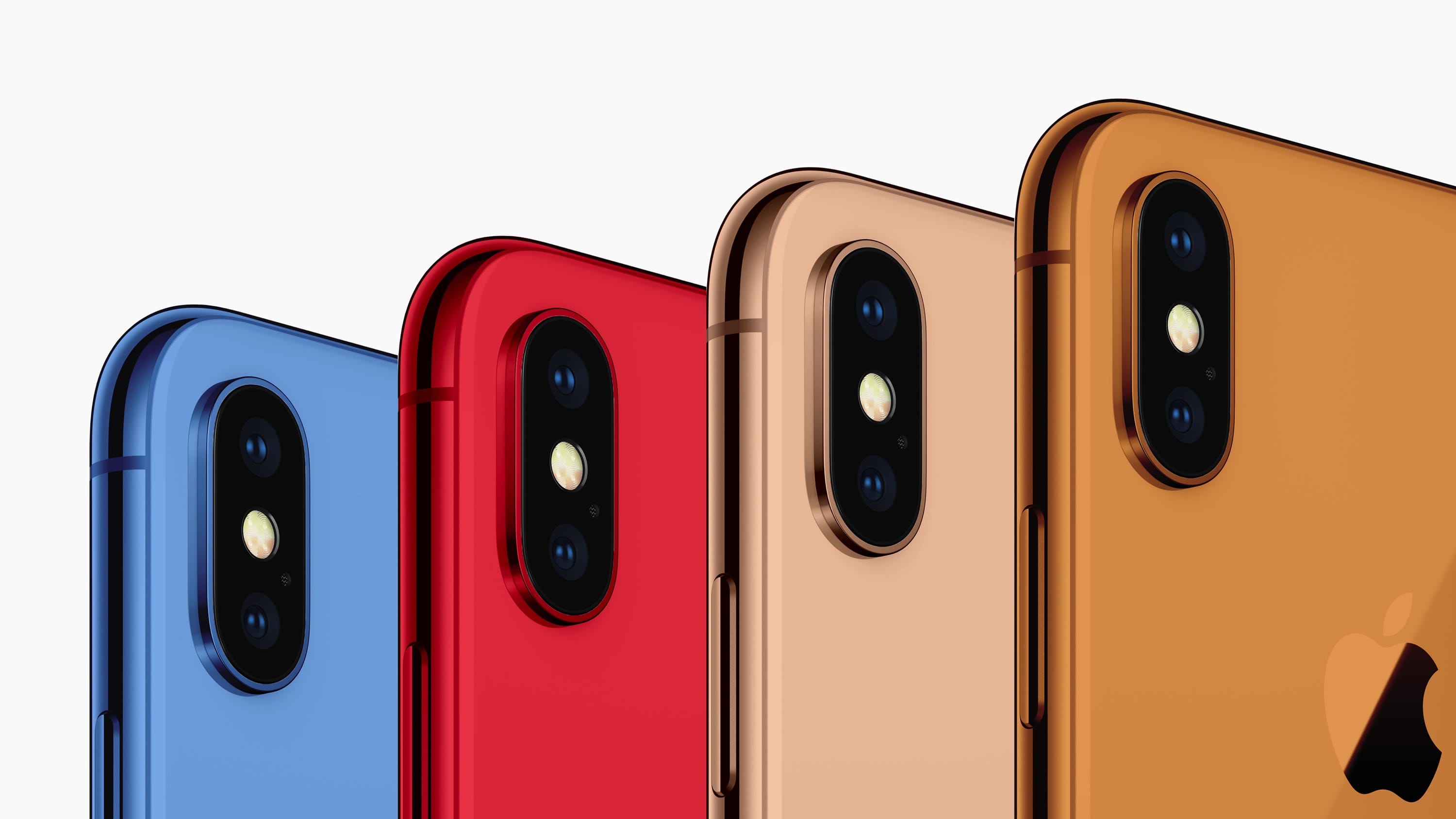
John Gruber: ‘The Whole Thing With 3D Touch and Haptic Touch Is Confusing’ →

April 29, 2020 · 10:21

John Gruber, on Daring Fireball:

But the whole thing with 3D Touch and Haptic Touch is so confusing, and has been handled so poorly by Apple in terms of how 3D Touch was used in iOS and which devices had it and which did not […] that you can’t possibly expect regular iPhone buyers to understand that the reason the new SE doesn’t support long-pressing notifications […]

The single thing I still miss most in my iPhone is 3D Touch. It’s been a few years now and Haptic Touch — long-pressing something — still feels so amazingly awkward, while slowing down the interaction at the same time. One of my favourite uses of the feature was to position my cursor precisely where I wanted to, when editing text. This is still possible by long-pressing the Spacebar and then moving the cursor to the desired location. The problem with the latter is that I often have to let go and restart this interaction, because I ran out of space on the screen to continue my drag. I really hope 3D Touch comes back one day, but I won’t be holding my breath.


Jony Ive to Form Independent Design Company With Apple as Client →

June 27, 2019 · 23:27

Apple PR:

Apple today announced that Sir Jony Ive, Apple’s chief design officer, will depart the company as an employee later this year to form an independent design company which will count Apple among its primary clients. While he pursues personal projects, Ive in his new company will continue to work closely and on a range of projects with Apple.

“Jony is a singular figure in the design world and his role in Apple’s revival cannot be overstated, from 1998’s groundbreaking iMac to the iPhone and the unprecedented ambition of Apple Park, where recently he has been putting so much of his energy and care,” said Tim Cook, Apple’s CEO. “Apple will continue to benefit from Jony’s talents by working directly with him on exclusive projects, and through the ongoing work of the brilliant and passionate design team he has built. After so many years working closely together, I’m happy that our relationship continues to evolve and I look forward to working with Jony long into the future.”

Design team leaders Evans Hankey, vice president of Industrial Design, and Alan Dye, vice president of Human Interface Design, will report to Jeff Williams, Apple’s chief operating officer. Both Dye and Hankey have played key leadership roles on Apple’s design team for many years. Williams has led the development of Apple Watch since its inception and will spend more of his time working with the design team in their studio.

Sounds like Apple didn’t have a lot to say in the matter.


The Design of Apple’s Credit Card →

April 9, 2019 · 13:30

Arun Venkatesan, on his blog:

I took a close look at the cardholder name and I noticed that it’s set in a new rounded version of the normal San Francisco font. For a few years, Apple has been using San Francisco Compact Rounded, a rounded version of the font used on the Apple Watch. This is the first time I have seen a rounded version of San Francisco though. The telltale sign is the lack of the flat sides that are most prominent in SF Compact’s lowercase a, e and o.

I haven’t yet compared SF Compact Rounded with SF Rounded myself, so I’ll trust Arun that they are indeed different, but I’m very curious how much further will the San Francisco family of fonts expand and how Apple will use them in the future.


100 Years of Bauhaus →

March 14, 2019 · 10:46

The Bauhaus was a lively school of ideas and a field for experimenting in the free and applied arts, design, architecture and educational methods. Here we present the phases the Bauhaus went through, the places where it based its activities, its teaching, the people behind it and their works.


The Design Flaw Behind MacBook Pro’s “Stage Light” Effect →

January 22, 2019 · 19:00

Taylor Dixon, for iFixit:

The issue is fairly simple: the current generation of MacBook Pro laptops (2016–present) uses flexible ribbon cables to connect the display to a display controller board beneath the Touch Bar. These cables wrap over the board, where they’re secured by a pair of spring-loaded covers—and they’re subjected to the stress of bending with every opening and closure of the laptop. Within a seemingly short time, those cables are starting to fatigue and tear. The backlight cable is generally the first to go, producing the infamous “stage light” symptoms, and eventually giving out entirely when the laptop is opened more than about 40° […]

But the bigger problem is that, in an apparent effort to make the display as thin as possible, Apple designed the cables as part of the display, so they cannot be replaced. This means that when (not if) those cables start to fail, the entire display unit needs to be replaced, as opposed to one or two little cables—effectively turning a $6 problem into a $600 disaster.

Imagine if you had to replace half of your car because a cable stopped working. This is simply horrible design.


Why It’s Hard to Read the Time on the Infograph Apple Watch Face →

October 10, 2018 · 15:42

Marco Arment:

The Apple Watch is an amazing feat of technology. It’s a computer. It can display anything. With no mechanical or physical limitations to hold us back, any watch-face design from anyone could plausibly be built, enabling a range of creativity, style, and usefulness that no single company could ever design on its own.

But they won’t let us. In a time when personal expression and innovation in watch fashion should be booming, they’re instead being eroded, as everyone in the room is increasingly wearing the same watch with the same two faces.

Open this door, Apple.

Apple could hand pick a few designers and developers for all I care. The current selection of Watch faces is stale and long in the tooth too. They need to address this sooner rather than later.


Paweł Jońca Featured on RetroSupply as One of the Most Inspiring Retro Illustrators →

August 24, 2018 · 09:49

Dustin Lee, for RetroSupply:

We’ve come across some incredible retro and vintage illustrators in our time. Whether you’re into mid-century advertising, pop art, traditional hand-lettering or beyond, there are some insanely talented artists pushing the boundaries of design and illustration – so we thought we’d round together a few of our favorites into one inspiring list of visual eye candy.

Paweł’s work is exemplary and I’m proud to have it hanging on my wall. He also illustrates our monthly iMagazine editions since 2008 or so. You can view some of his favourite pieces here.


The Bullshit Web →

August 3, 2018 · 11:08

Nick Heer:

An honest web is one in which the overwhelming majority of the code and assets downloaded to a user’s computer are used in a page’s visual presentation, with nearly all the remainder used to define the semantic structure and associated metadata on the page. Bullshit — in the form of CPU-sucking surveillance, unnecessarily-interruptive elements, and behaviours that nobody responsible for a website would themselves find appealing as a visitor — is unwelcome and intolerable.

Whenever I stumble upon a web page which falls under Nick’s “bullshit” category, I just close it. This includes sites that demand I turn off my script blocker, which I use to block “CPU-sucking surveillance” and similar items.

It’s really past time that we started cleaning up this dump that we created.


Limited Edition Tesla Surfboard →

July 30, 2018 · 10:14

Designed by the Tesla Design Studio in collaboration with Lost Surfboards and Matt “Mayhem” Biolos, surfboard shaper for World Surf League Championship athletes. The Limited Edition Tesla Surfboard features a mix of the same high-quality matte and gloss finishes used on all our cars. The deck is reinforced with light-weight “Black Dart” carbon fiber, inspired by the interiors in our cars, and featuring tonal logos in subtle contrast gloss.

Model S, X and 3 can comfortably accommodate this surfboard on either the inside or outside of the vehicle.

I know nothing about surfboards but it is beautiful. And sold-out already.


The MacBook Pro Core i9 Cannot Maintain Its Base Clock Speed Under Load

July 18, 2018 · 13:44

Dave Lee posted a video yesterday, showing a Core i9 mid 2018 MacBook Pro averaging 2.2 GHz under load, during an Adobe Premiere render.

The results show just how badly Premiere is optimized for the Mac — a Gigabyte Aero 15X is over 30 minutes quicker (39:37 vs. 7:18) — which has led AppleInsider’s Mikey Campbell to write the following:

It should be noted that Premiere Pro is not optimized for Mac, as evidenced by the Aero 15X performance. Lee failed to test render speeds with Apple’s Final Cut Pro X, or any other app for that matter.

While thermal throttling is nothing new, especially in portables, Lee’s findings are somewhat questionable in that assumptions are being made based on a single machine’s performance with an unoptimized app. Making blanket statements without thorough testing is reckless at best and disingenuous at worst.

While Lee failed to reach out to Apple for comment, it is highly unlikely that the company would ship a flagship product without first rigorously testing its performance. That goes double for a device like MacBook Pro, considering the company’s renewed vigor to serve the professional market.

It took me about 30 seconds to find the following video which exposes the same issues in the 2017 models. The render was done in Final Cut Pro X this time…

In fact, there are many more videos on the subject, so while it is possible that this is a problem with Dave’s specific machine, I’ll go crazy here and suggest that it’s a design problem, especially since there are many reports that just using an external display is throttling some machines, which has led some users as far as replacing the thermal compound that Apple uses on its CPUs.

I have the same issue on my MacBook Pro Escape (late 2016) when rendering larger projects in Final Cut Pro X (especially in 4K) — it slows down considerably the further the render is along.


A Collection of All the Stupid MacBook Pro Problems That Still Aren’t Fixed →

May 24, 2018 · 11:59

Owen Williams, on Charged:

I’ve spent a year explaining to people that while the current MacBook Pro is a design triumph, it’s a disaster of a product that you shouldn’t spend money you’re afraid to lose on — but it’s been difficult to articulate why, particularly when the sample set is small.

Instead, I’ve decided to maintain this post, which is an ever-growing collection of public complaints about the 2016 and 2017 MacBook Pro so I can just send it back in response to anyone who says they’re considering buying it.

almost tripped on my MacBook Pro’s power cord a few weeks ago and my first thought was that I really miss MagSafe, which saved my previous MacBooks a number of times. As it turns out from looking at Owen’s list, no MagSafe is one of the least important issues people are having.


An Animated GIF Guide to the First Wave of Personal Computers →

May 24, 2018 · 11:55

Matthew Gault, writing for Motherboard:

To honor those machines, Ball has created a series of high resolution animated gifs honoring 16 machines from the era of the birth of the personal computer. He calls the project ‘I Am a Computer: Icons of Beige.’

“I think the design of these machines is so of their time, so charming in their now-obsolesce, and almost anthropomorphic in some cases that I wanted to…breathe some life into them,” Ball said. “I also love beige. Nothing is beige anymore! It’s such a cool colour.”

I love these kinds of projects.


Jaeger-LeCoultre Polaris Memovox →

May 12, 2018 · 13:18

A contemporary design of a Grande Maison classic created in 1968, the Jaeger-LeCoultre Polaris Memovox watch in steel punctuates the important moments of the active man’s life. It is available in a limited series of 1,000 editions.

I have a hard time finding watches that I really like and the new limited edition Polaris Memovox is one of the few which I find simply stunning. They do offer a much cheaper Polaris Automatic but despite the differences between the two being very subtle, I don’t care for it at all.


macOS Screen Savers by Johansson Design →

May 11, 2018 · 10:29

Johansson Design is probably the only company currently creating new screen savers for macOS, and my goal is to create (post)modern, pop-culture inspired screen savers that can be both practical and used as a form of self-expression.

They are all free and there are at least two in there that piqued my interest. You can get them for free and can donate to the author if you want to.


The Belgian Cowboy E-Bike →

May 11, 2018 · 10:17

Hydraulic brakes, a belt instead of a chain, a weight of 16 kilograms, a SIM card slot, integrated GPS and tracking, a 252 Wh detachable battery, pedal assist, and integrated lights. All this for €1790.

Unfortunately this e-bike is only available in Belgium and Luxembourg. For now…


Mapping Apple’s Space Gray Shades →

April 17, 2018 · 00:50

Michael Steeber, writing for 9to5Mac:

Silver aluminum, once the defining look of Apple products, has been met with increasing variety over the last several years by a range of colors and finishes that customers can choose from. One of the earliest and most popular options – space gray – has permeated across almost every product line Apple offers.

Yet, ubiquity has not brought consistency. Each new generation of a product seems to bring with it a slightly different take on space gray. Those with large device collections have noted the discrepancies between shades, and discussions brew online over the term’s exact definition.

While subtle variations in material, texture, lighting, and even the shape of a product can play tricks on the eyes, every device Apple currently offers or has produced in space gray can be grouped into one of several loosely defined categories. Below, we’ve cataloged and categorized the vast universe of Apple’s recent dark material finishes in an attempt to unravel the mysteries of space gray.

Car manufacturers use a different name for every single shade of grey they offer. I can’t help but think that Apple was very uncreative in their Space Grey endeavor — they had all the words in the world to use and decided “Space” was good enough, despite the shades being completely different between generations and devices.

I would love to understand their reasoning behind this (bad) decision.


April 11, 2018 · 10:59

I’m sitting with my 2016 MacBook Pro Escape on my lap, connected to its charger, really missing MagSafe. I have not yet tripped over the cord, but it has been close a few times now. All I can do is fondly remember how many times MagSafe saved my 2014 MacBook Pro.


ASUS ZenFone 5 — Designed to Look Like an iPhone X →

March 6, 2018 · 07:38

Ian Cutress, for AnandTech:

Today ASUS is launching a smartphone that is designed, according to the speaker at our prebriefing, to make it look like the user is holding an iPhone X. The new ASUS ZenFone 5, part of the ZenFone 5 family, comes with a notch. Apparently this is what the company says that its customers want: the ability to look as if you have an iPhone X, but have something else.

Am I in a dream? I really need to take the blue pill.

P.S. Yes, I’m behind on my RSS.


iMac vs. iMac Pro — Apple’s Bad Design Priorities →

January 11, 2018 · 12:51

Stephen Hackett, writing for iMore:

I decided to take the conservative route, so I ordered the regular iMac. It showed up the day after Christmas. I slapped 32GB of OWC RAM in it — for a total of 40GB — and migrated my data from my trusty 2015 model.

Unfortunately, it didn’t take long to realize that I had made a mistake. Even during the migration, I could hear the new iMac’s fan blowing, and once I was logged in, it was even louder.

After any data migration, a Mac has a lot to do behind the scenes. Photos.app was busy reindexing my library, and Dropbox was working hard to make sure everything in its folder was supposed to be there. I let things run over night, thinking that by the next morning, this new iMac would be as quiet as my old one in normal usage.

Sadly, that wasn’t the case. I’ve heard very mixed things about this from people on Twitter and friends with 2017 iMacs, so I can’t say this is a universal truth, but the Core i7-powered iMac on my desk seemed to ramp up its fan far more often than my older i5, and when it did, the noise was noticeably louder than before.

Indexing Photos and Dropbox is not something that should make a powerful iMac, equipped with a Core i7, costing close to $3K, sweat. I know that because I built a Hackintosh based on an iMac’s specs — it has a much beefier GPU but it’s basically a 2013 iMac on paper. Its fans still spin at their slowest speed when the machine is chugging along, crunching 4K data in Final Cut Pro X. If the top-of-the-line iMac starts screaming at the top of its lungs during the basic stuff, then something’s wrong. It could be a software issue, but I’ve heard enough people complaining about the fans in various scenarios, that this sounds like a bad design decision.

Granted, the iMac Pro does seem to solve the problems Stephen’s having, but to me it sound as if his issues are the most basic tasks, which most Mac users do. A $5K+ iMac Pro should not be a “solution” to this problem. An iMac Pro is a workstation, aimed at demanding workflows. And I still have my doubts whether this is the appropriate machine for the task, especially since a 2010 Mac Pro equipped with a Vega 64 is still faster in OpenCL than a 2017 iMac Pro.

Apple’s crusade for making everything thinner and sleeker is ruining their machines. They are making their products more and more niche, while not providing computers for the masses. I’m sure there’s a market for a desktop computer like a Mac Pro, but with cheaper hardware and full-sized GPUs – I know I’d switch to that from my Hackintosh in a heartbeat, if the GPU was upgradeable, and I’m sure many more would too.


The iMac Pro Is Amazingly Silent →

December 28, 2017 · 14:13

Jason Snell, writing for Six Colours:

When running HandBrake, the fan on my 5K iMac would always crank up and was quite audible when it did so. So far as I can tell, the iMac Pro’s fan may always be running, but it’s amazingly quiet. In my normal office environment, I can’t hear it—only when I spun the iMac Pro around and listened with all other devices off could I hear it, faintly blowing. When HandBrake was running at full speed, the iMac Pro sounded pretty much the same—but the air coming out of the vents on the back was definitely warmer!

I wonder how well the components inside that unnecessarily small case will fare from the heat over an extended period of time. This is my biggest iMac complaint — the back of the display could be both thicker and deeper, like the older iMacs. I’ll admit it looks good, but I’ll take cooler running internals over visual aesthetics every day of the week.


Not As Essential — Andy Rubin’s Phone Gets A $200 Price Drop →

October 23, 2017 · 08:44

Darrell Etherington, writing for TechCrunch:

Regardless of the reason, the price drop makes Essential arguably the best value smartphone on the market, and definitely the best Android device in that range. It’s one major failing has been its camera, which launched as a slow and buggy feature compared to most out there, but the subsequent camera software updates have improved its speed and reliability a lot, and more updates are promised in the future, too.

It will take a while before we get to the designs of the phones they used in The Expanse. Accepting all of the design trade-offs until we get there won’t be easy. They will however fuel the fires of many flame wars to come.


The Stupidest Trend In Online Journalism

October 20, 2017 · 12:25

For some completely obscure reason, websites have started requiring users to click a button/link after opening an article. I have had this happen multiple times on various sites over the past year or so. What happens is that I click on a link, which opens the page in my browser, which ten shows me usually part of the first paragraph, followed by a “Click here to read the whole article”.

I clicked the link. They got me interested. Now all they have to do is to let me read in peace. But no, they don’t. They require further clicks. What for? Engagement? Page views? And people wonder why people’s attention span is low…

Entertainment Weekly went to a whole new level today, in an article about Blade Runner 2049, which has a total of five short paragraphs, of which four are cut short, followed by a “More…” link. I had to click a total of five times to read the whole thing.

Well… I would have, had I been bothered too. Instead, I closed the tab.


I’ll get back on the subject when I have more time to spare.


The Butterfly Effect (On The New MacBooks & MacBook Pros) →

October 18, 2017 · 09:17

Casey Johnston:

Perhaps it’s true that less dirt gets under butterfly switched-keys. But therein lies the problem — when dirt does get in, it cannot get out. A piece of dust is capable of rendering a butterfly switch nonfunctional. The key won’t click, and it won’t register whatever command it’s supposed to be typing. It’s effectively dead until someone can either shake loose the debris trapped under it or blow at the upside-down keyboard Nintendo-cartridge style. Meanwhile, Apple quietly put up a page with instructions expressly to try and help people with dead butterfly switch keys.

The problem with dead keys is that, unless you can stop what you’re doing mid-paper or report or email or game and have a physical tiff with your computer, the temptation to just slam a little harder on those delicate keys to get the N or B or period you need until you reach a stopping place is high. But there is no logical at-home remedy for the consumer; when one key on a butterfly switched-keyboard becomes nonfunctional, unless you can dislodge whatever dust or crumb is messing it up without being able to physically access it, the keyboard is effectively broken. If you remove the key to try and clean under it, you stand a high chance of breaking it permanently, but if you leave it there and continue to have to pound the key to type one measly letter, you also might break it permanently. A single piece of dust can literally fuck you over.

My 2016 MacBook Pro Escape keys like to get sticky when I’m hammering away at the keyboard in the sun, probably due to the key caps expanding from the heat.

This is bad design.


Paweł Jońca’s Brilliant Apple Commentary in Illustration Form →

October 11, 2017 · 12:39

Paweł Jońca:

iMagazine (formerly Moje Jabłuszko) is a Polish digital lifestyle magazine which focuses on technology and Apple.

Since it’s birth, I have a page dedicated to my artistic commentary — sometimes in Polish, sometimes in English, but always about current technological events from around the world, usually about Apple.

His commentary for iMagazine is fantastic. Make sure to take a peek at all of his work over on Behance. You can also find more of his work here.


A Thousand Yes’ For Every No →

October 7, 2017 · 16:14

Joshua Topolsky:

Plenty has been written about the mind-numbing, face-palming, irritating stupidity of the notch. And yet, I can’t stop thinking about it. I would love to say that this awful design compromise is an anomaly for Apple. But it would be more accurate to describe it as the norm.

iPhone always were (and still are) distinguished by the rather obvious round home button — with it gone, they would just look like any other. I’m guessing this is one of the reasons that they chose to go with the ears and notch, which allow the screen to be almost bezel-less, creating a unique front design.

This doesn’t mean that we should adore it — I’m still on the fence, but leaning towards not liking it — or even accept it. Apple’s not forcing us to buy this model, but I wish they hid the notch, or even added a small chin and forehead to the design, a bit akin to the Galaxy S8. I’m pretty sure some are going to love the new design and gestures, while others will hate readjusting to the new paradigm. Personally, I’m worried about the pause needed, when swiping up, to get to the app switcher — pauses disrupt gestures.

I can’t help but think that the old “a thousand no’s for every yes” is near gone from Apple’s culture. I hope not, but looking at the big picture, it sure seems like it.