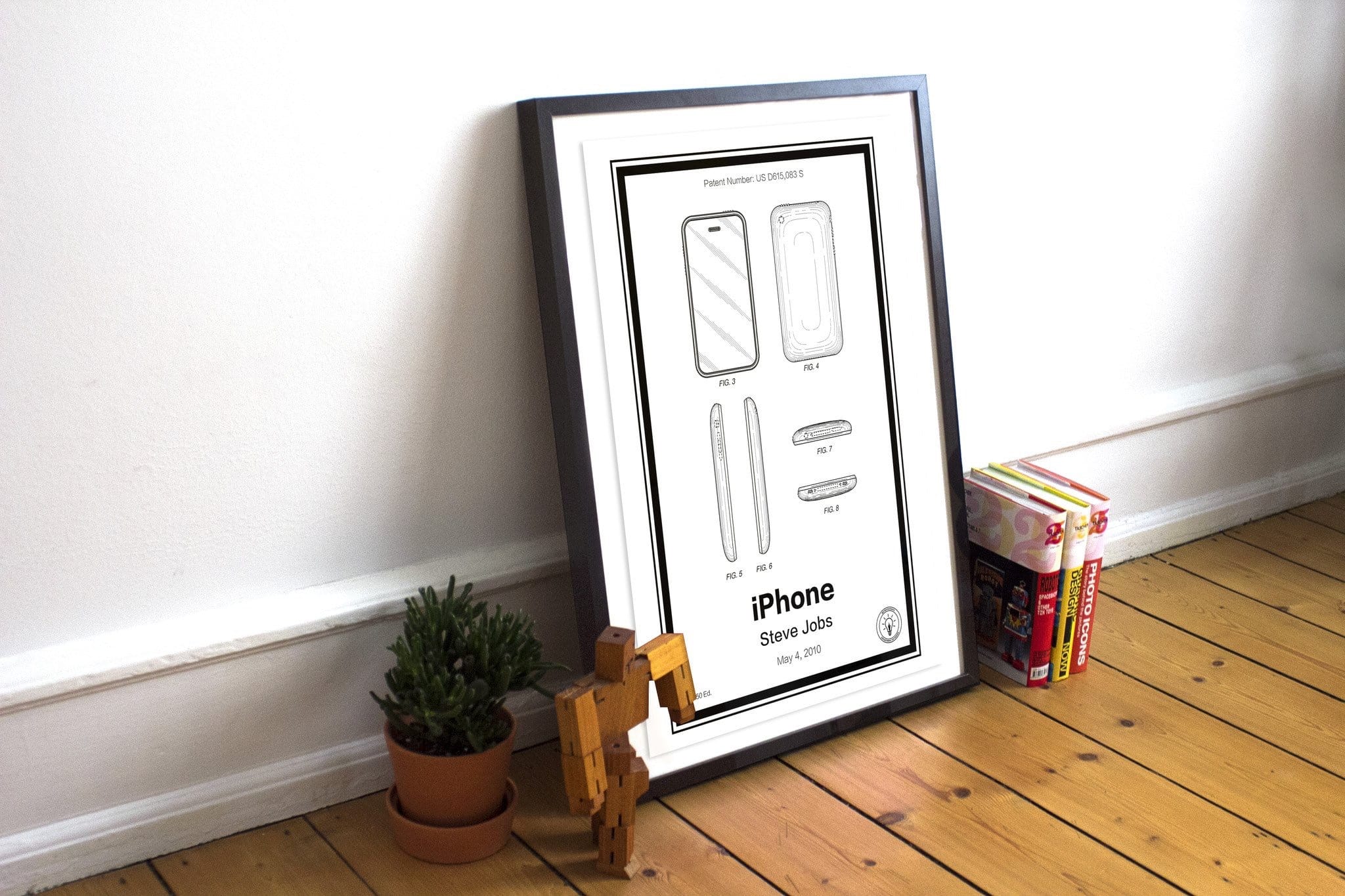
UI Design for iPhone X: Top Elements and the Notch →

October 6, 2017 · 14:07

Max Rudberg:

Regardless of your feelings for the notch, the reality is that to do a near edge-to-edge screen on a phone in 2017; you need to make place for sensors and speaker. The technology to hide them behind the screen simply is not here. We’ve seen different manufacturers choose different solutions to the problem. This is the one Apple chose, so let’s work with what we got.

People will get over the notch sooner or later, but I’ll bet the jokes will be piling on for years to come. Personally, I’m still undecided — I will need to see it in person first.

Oh! Make sure to check out Max’s post — lots of good, sensible design information there.


Designing Websites for iPhone X →

September 23, 2017 · 10:53

Timothy Horton details how to design websites around the notch, to take full advantage of the iPhone X’s display:

Out of the box, Safari displays your existing websites beautifully on the edge-to-edge display of the new iPhone X. Content is automatically inset within the display’s safe area so it is not obscured by the rounded corners, or the device’s sensor housing.

I’m curious to see how websites will creatively use the notch to their benefit. I have a few ideas myself, but nothing solid yet.


Design Before You “Minify” →

May 22, 2017 · 08:29

Don Melton:

Then again, what the hell do I know? I’m just an old Web browser guy. So I’ll leave you with this quote, sometimes attributed to Albert Einstein, that I kept in my .plan file back when that was a normal thing to have around:

Everything should be made as simple as possible, but no simpler.

I’m just trying to get people to think a little bit more before they deploy. I certainly wish I had here.

I’m in the same boat as Don — I really should overhaul this site to make it simpler, so it would hopefully load faster.


Retro Patent Prints →

January 26, 2017 · 09:35

Retro Patents:

Discover limited edition vintage patent prints that helped shape the technology, design and gaming industries.

From IBM’s vacuum tube computers to Nintendo’s first cartridge based gaming consoles.

We have designed beautiful bespoke prints based on some of the keystone inventions of our generation from companies such as Apple, Google, Amazon, Sony, AirBnB and more.

Each patent has been designed and printed using HDR ink-jet technology on Ultra Premium Luster Photo Paper with a basis weight of 180 gsm.

A great idea and awesome execution.


Sir Jony Ive Reflects on the Nature of Objects, the Fragility of Ideas, and 20 Years of Apple Design →

November 16, 2016 · 09:05

Tony Chambers:

This is a comprehensive and objective portrait of Apple products produced over the past 20 years. ‘It is a book with very few words,’ writes Sir Jony Ive in the foreword. ‘It is about our products, their physical nature and how they were made.’ The pages that follow trace two stratospheric decades of product design with the effortlessness that’s become synonymous with the company.

It is a quiet and elegant work, a high-quality piece of book design, typography and production. It is far from a show-off vanity project. Great care, time – and money – has been spent on making it a paean to good, useful design and manufacturing. It is also of course a paean to Steve Jobs. In the five years since his death, Apple has forged on without him. Designed by Apple in California is a tribute both to him, and to the products that have shaped our future.

The tome is Apple at its purest: the products. We caught up with Ive to find out more…

This project, according to Jony Ive’s words from the interview, has been eight years in the making.

The book itself is supposedly just pictures. I expected meaningful thoughts and written content inside.


Rob Janoff Talks About His Apple Logo Design →

September 28, 2016 · 11:59

Touraj Saberivand:

While working in their garage in 1977, Steve Jobs and Steve Wozniak asked Rob Janoff, who had studied design, to create a logo for their first Apple products. When Janoff went to Jobs with final sketches, everything went very smoothly, and the bitten apple has been the symbol of the brand ever since.

The whole piece is worth a read — lots of great tidbits; much too many to quote here.


Free BB-8 icon for BBEdit from Jimmy Hartington →

February 5, 2016 · 16:16

This is how to use replace the default BBEdit icon with the BB-8 edition:

  1. Click the link in the title.
  2. Download the file which contains the icons.
  3. Unzip the archive.
  4. Open the BB8dit@1x.png file with Preview.app.
  5. Press ⌘A to Select All.
  6. Press ⌘C to copy the image to the clipboard.
  7. Open a Finder window and go to /Applications/ or wherever you have BBEdit installed.
  8. Highlight BBEdit and press ⌘i to bring up the information window.
  9. Click on the BBEdit icon in the top left corner of the window — it should highlight with a blue outline.
  10. Press ⌘V.
  11. Close the window.

If you ever want to revert back to the original icon just open up the info window in step 8, select the icon and press Delete on your keyboard.

Thanks @jimmyhartington!


Free Bjango App Icon Templates →

January 27, 2016 · 08:23

Bjango:

A comprehensive set of app icon templates for Photoshop, Illustrator, Sketch, and Affinity Designer. The templates cover Android, iOS, OS X, Apple TV (tvOS), Apple Watch (watchOS), Windows, Windows Phone and web favicons. Where possible, they’re set up to automate exporting final production assets. All free and open source, released under the BSD license.


Kit Hinrichs’s Typography Calendar →

December 17, 2015 · 09:50

Terri Stone:

There are no illustrations or photos in the calendar, named 365. Type plays the starring role, with each month showcasing a different face. Numbered days of the month dominate the page, but look in the upper left-hand corner of the page and you’ll see a small block of text that quietly delivers information about the typeface, its designer, and contemporary technological influences.