I’ve long been a fan of distraction-free writing tools, ever since admitting to myself that I’m a Markdown addict. Writing in plain text, with just the most basic formatting, is something I started believing in ever since I started having issues with my documents between various… versions of Microsoft Word. I don’t know what will be the standard in the next five or ten years but I do know that I want to be able to access my data without any hassle.
iA Writer and Byword
It all started with Byword and the wonderful iA Writer from Information Architects. I only used the former in the evenings and at night due to it’s ability to change themes even though I preferred the latter. This was mainly because of the wonderful font choice — Nitti fit my tastes perfectly. I also needed software which was available for both iOS and OS X — I sometimes travel with only my iPad. This changed ever since I got the smallest MacBook Air; I don’t use an external keyboard on my Mini with Retina display anymore, but I still write a lot on it. This posed a number of different challenges — I needed the iOS edition to also export to HTML. This allowed me to paste directly to WordPress without installing any fancy and troublesome plugins — the CMS I post to does not support Markdown and won’t do so until it’s implemented natively. It did take a while for the export function to get implemented in iA Writer but it worked perfectly in Byword.
I’ve been using Byword recently on OS X due to it’s new function — the ability to publish directly to WordPress. I was also having issues with proper sentence highlighting while scrolling in Writer, which pushed me towards Byword more often than not. I did however miss iA Writer’s Nitti and the whole UI every single time I used it’s rival. I wasn’t perfectly satisfied, although I didn’t know it at the time.
And then the teasers started…
A few weeks back I saw the first teasers for Writer Pro and that got me really excited. I tried my best to get on the beta bandwagon as well — I’m obviously a Nitti and clean UI addict. Unfortunately, the guys at Information Architects never invited me over but that didn’t stop me from staying up late until the official launch. The evening ended without success however and I drifted off into a dreamless sleep. I naturally overslept the next morning and had to rush to get to a meeting I had planned. Since I only had my iPad with me, as well as a few minutes to spare while waiting for my party to arrive, I quickly purchased Writer Pro despite it’s price tag — not something iOS users are used to. It’s currently set at $19.99 (€17.99) for each of the versions for OS X and iOS — the latter supports both the iPhone and iPad though, so in theory you could argue that’s it’s 50% cheaper. After launching it and poking around the new UI, I started to check out the new gestures. And then I almost cried — two extremely important features were absent…
You never have a second chance to make a first impression, but the guys at iA do …
When I got back to my Mac I was rather dejected — Writer Pro wouldn’t be able to fit into my mobile workflow and I was actually considering saving my money and not getting the OS X version. Those thoughts only lasted a moment — the download was quick and painless. The text message that confirmed the charge on my credit card made me pause for a second or two though …
Writer Pro

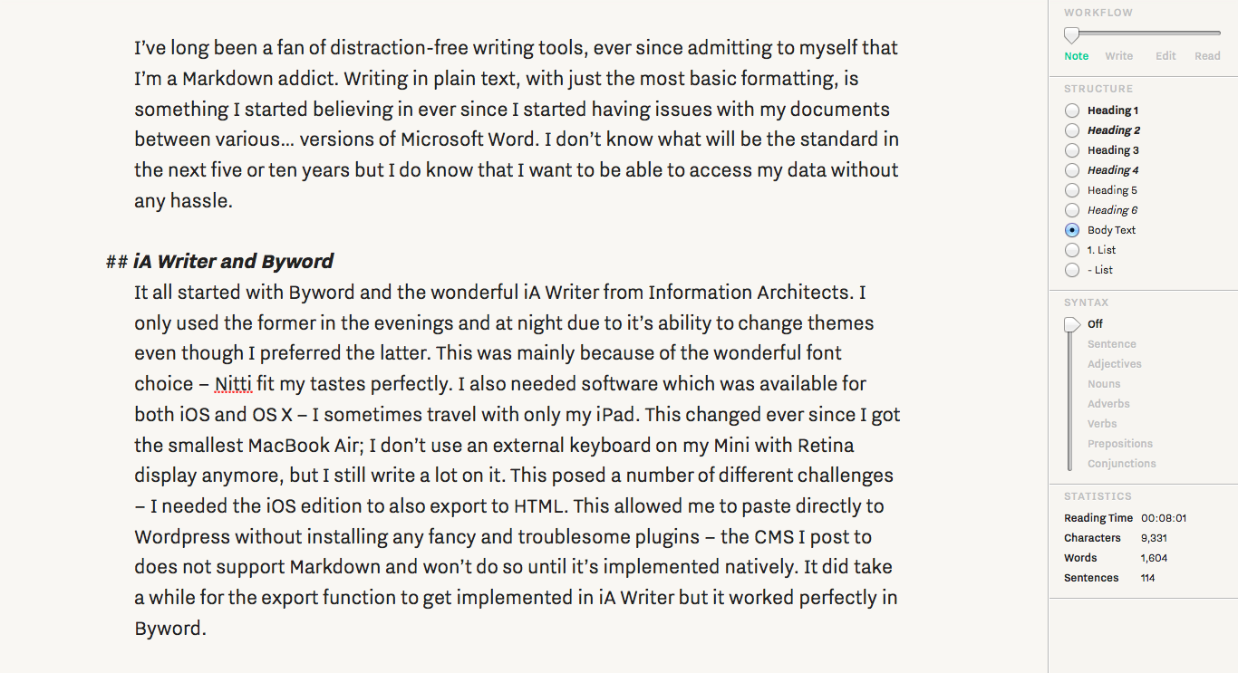
Writer Pro — Note view
I’ve been using Writer Pro for OS X for the past six days and cannot imagine going back to anything else. iA Writer seems dated. Byword’s ability to publish directly to WordPress doesn’t seem as enticing as it once was. Writer Pro feels fresh and exciting, beckoning me, making me want to write more and more. All of these thoughts and feelings are present despite the user interface being more or less the same — the side panel with various settings is definitely different, yet it doesn’t distract me in the slightest. Everything feels right — thought out and polished. And to think I almost skipped buying it…
Informations Architects based their new writing workflow on Hans Blumenberg’s theories in his book titled “Sources, Streams, Icebergs.” It consists of four steps — note-taking, writing, editing and proofing/publishing — and that’s how Writer Pro is structured. A slider in the new sidebar emphasizes this along with different fonts and cursor colours for each section. iA selected the proportional Nitti Grotesk for the “Note” section, the monospaced Nitti (the exact same one that was used in iA Writer) for “Write” and comfortable Tiempos for “Edit” and “Read.”
The sidebar also allows text formatting (in Markdown) using the mouse — it contains a list of various HTML/Markdown tags that are often used. I would gladly welcome an option to turn this off — I prefer to type them myself. The fourth and last section displays various statistics that many writers live by — things such as time spent reading our text while composing it, as well as the number of characters, words and sentences. It’s the third option which is truly revolutionary however — Syntax Control™.
Syntax Control

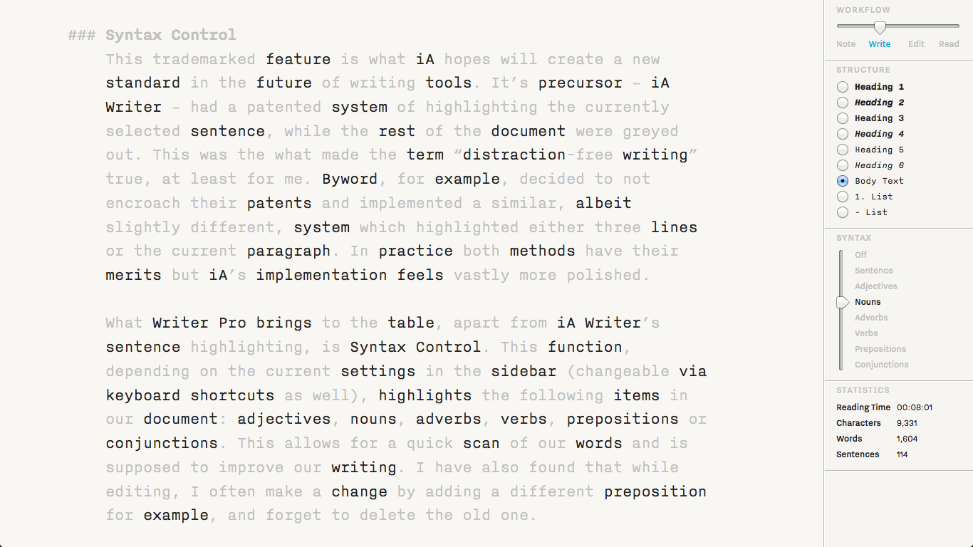
Writer Pro — Edit view with Syntax Control
This trademarked feature is what iA hopes will create a new standard in the future of writing tools. It’s precursor — iA Writer — had a patented system of highlighting the currently selected sentence, while the rest of the document was greyed out. This was the what made the term “distraction-free writing” true, at least for me. Byword, for example, decided to not encroach on their patents and implemented a similar, albeit slightly different, system which highlighted either three lines or the current paragraph. In practice both methods have their merits but iA’s implementation feels vastly more polished.
What Writer Pro brings to the table, apart from iA Writer’s sentence highlighting, is Syntax Control. This function, depending on the current settings in the sidebar (changeable via keyboard shortcuts as well), highlights the following items in our document: adjectives, nouns, adverbs, verbs, prepositions or conjunctions. This allows for a quick scan of our piece and is supposed to improve our writing. I have also found that while editing, I often make a change by adding a different preposition for example, and forget to delete the old one. This happens all to often and Syntax Control makes the error extremely obvious.
Chances are that once you see Syntax Control in action you’ll see the benefits immediately. When editing a text, writers subconsciously scan for bad signs. Theses signs form syntactic patterns:
– Long sentences that ramble without a clear idea
– Excessive or empty adjectives over-spicing the text
– Unwanted repetition breaking the text’s flow
– Lame verbs weakening the prose
– Incorrect conjunctions leading to bad logicGrammar and style rules do not improve text quality if you follow them blindly. Repetition is not evil by nature — unwanted repetition is. Long sentences work flawlessly when consciously crafted. Adjectives are efficient when chosen with care.
I haven’t yet spent enough time in Writer Pro to confirm all of the above in my case, since I write mainly in Polish, but it indeed seems to work — you do have to put the time in for editing though… Writer Pro will not do the work for you, but it will make it easier.
Unfortunately, Syntax Control only currently supports English, French, German, Italian and Spanish. This is obviously an issue for me, since I do most of my writing in Polish… And since this review is the first one that I’ve written in Writer Pro using the language part of Syntax Control, I have yet to formulate a final verdict. It is extremely promising however, especially for people who don’t write in their native language.
Missing features

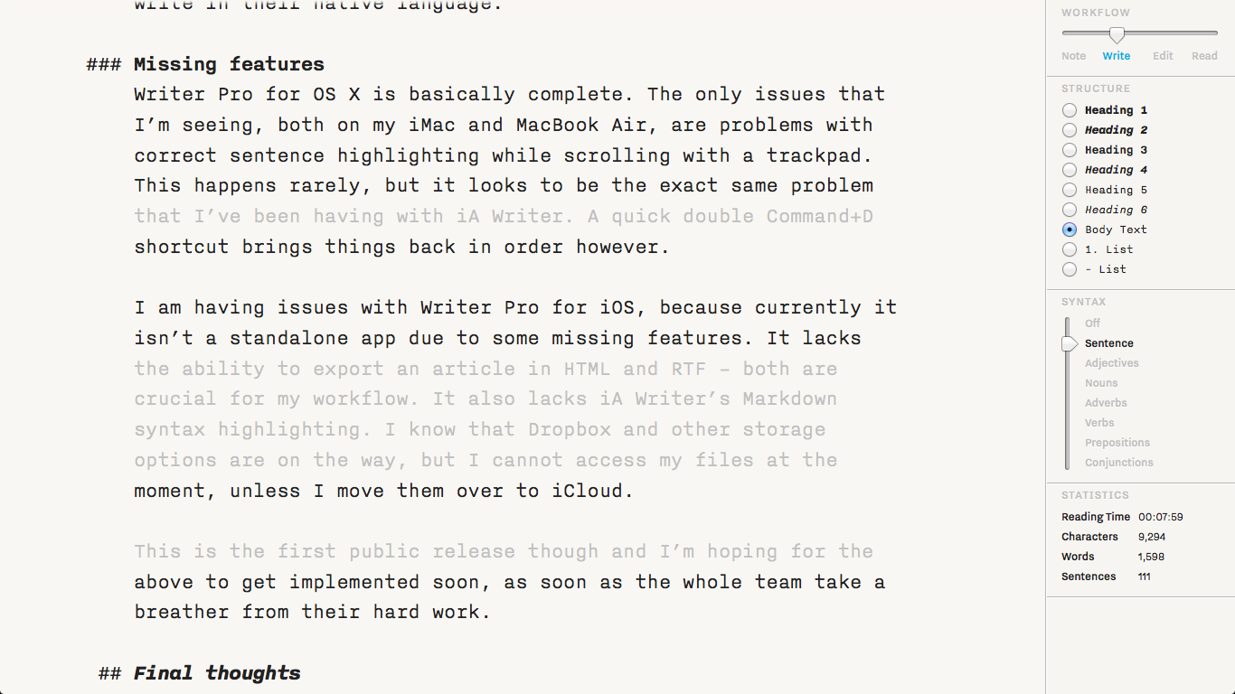
The highlighting bug, which reveals itself while scrolling, persists from iA Writer.
Writer Pro for OS X is basically a complete package. The only issues that I’m seeing, both on my iMac and MacBook Air, are problems with correct sentence highlighting while scrolling with a trackpad. This happens rarely, but it looks to be the exact same problem that I’ve been having with iA Writer. A quick double Command+D shortcut brings things back in order however.
I am having issues with Writer Pro for iOS, because it currently isn’t a standalone app due to some missing features. It lacks the ability to export an article in HTML and RTF — both are crucial for my workflow. It also lacks iA Writer’s Markdown syntax highlighting. I know that Dropbox and other storage options are on the way, but I cannot access my files at the moment, unless I move them over to iCloud. It does supplement the OS X edition however.
This is the first public release though and I’m hoping for the above to get implemented soon.
Final thoughts
When I began writing this review I wasn’t sure if and where Writer Pro would fit in my workflow. This has since changed and all it took was less than two thousand words. Amazing. I’m sold on the Mac version — it’s worth paying every eurocent for it — but still have my reservations about the iOS edition. Personally I would have held out until the export features were added, had I known they weren’t there. Nevertheless, it is still usable if used as a note-taking tool.
P.S. There is also one keyboard shortcut which I miss… a lot. Byword uses Command+K to create a hyperlink around the selected words — it puts them in square brackets, adds parentheses after them and places the cursor inside of the former. This is something which I use extremely often — please consider adding this!
And please fix the scrolling-highlight bugs…


Pingback: Markdown — the shit just hit the fan | Infinite Diaries by Wojtek Pietrusiewicz
Pingback: Moja aplikacje na MacBooku Pro z Retiną | Makowe ABC
Pingback: Markdown — the Shit Just Hit the Fan | Infinite Diaries