I’ve spent the last few years, ever since getting my first iPhone in 2008, enjoying two things that Apple’s pocket computer provided: easy one-handed use and decent battery life. Those two things were always on the top of my list of favourites and became even more prominent since getting the first iPad. I’d use the bigger screen at home, where two-handed use isn’t an issue, and the iPhone on the run.
In the meantime I had the opportunity to use other devices, including many review units, mostly various forms of Android with some Windows Phones added to the mix. I’ve even had my own private HTC One X, One M7 and a Nexus 4 — I never did grow attached to them though, but they did help me learn more about Apple’s competition. They were obviously much bigger phones than my iOS devices and that was their problem — I could never get used to using them two-handed, and one-handed use was a pain. I do have fond memories of a 4.3” phone, which I deemed the largest acceptable size for my hands. There was an issue with all of the above however — they were all pretty thick.
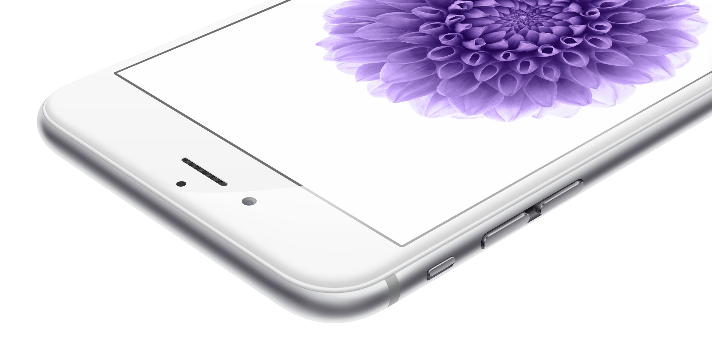
Apple has a tendency to make iPhones as thin as possible. This is especially true with the new ‘sixes’ where I only found Samsung’s new Galaxy Alpha to be thinner by a fraction. They’re both so thin that the lens has to protrude from the case — not all laws can be stretched or broken. While this is a minor visual annoyance, I would much prefer for the iPhone 6 and 6 Plus to be slightly thicker and feature larger batteries instead. I’m often out on foot for long periods of time and the additional backup power could be useful from time to time. My 5S does get me through a typical day and I’ve only had it run out of juice once during the past year or so. The funny thing is that until recently most Android phones, with their huge batteries, had trouble keeping up with the iPhone in terms of battery life. I was first impressed by the HTC One M8 — this monster phone would “go on and on and on…” — and I’m extremely curious as to what both iPhones will offer.

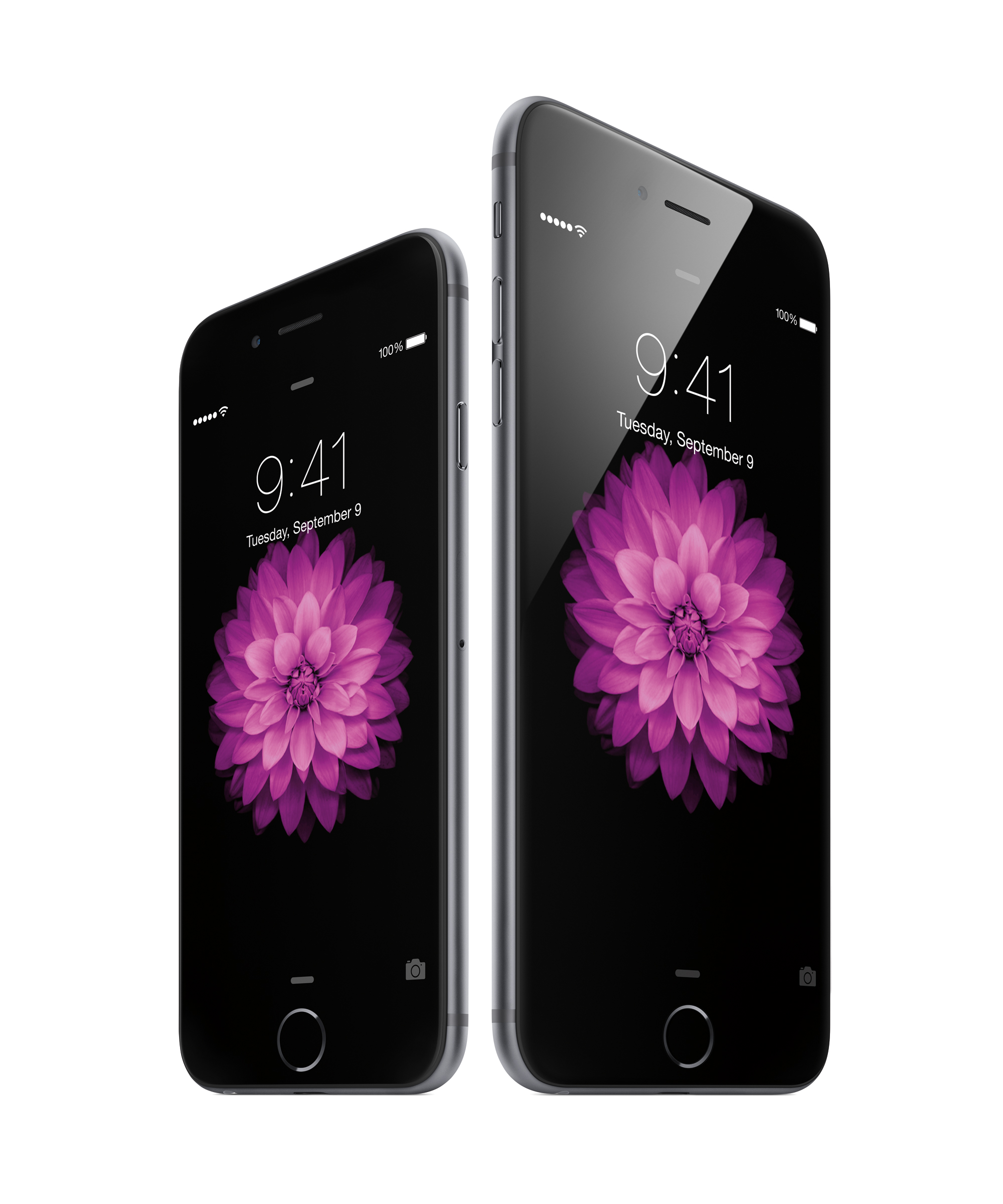
iPhone 6 and 6 Plus
“A dazzling display of common sense”
I’m a bit frustrated with Apple’s marketing efforts. After the iPhone 5 launch, they aired an ad called “Thumb” which explained their reason for not going for a larger screen. “A dazzling display of common sense” they said at the time. The thing is, I still have problems reaching the top left corner of the screen on my 5S. “Today” they threw their common sense out of the window and went for a “normal”, by Android’s standards, 4.7 inch display and unapologetically gigantic 5.5” behemoth. The thing is that I actually have a 4.7” phone at home at the moment and I hate using it one-handed.
There are two things keeping my frustration in check — the aforementioned hope that battery life will be greatly increased and how beautiful they are. I have no doubt that the screens themselves will be gorgeous but I am worried about ergonomics. I’m a guy who likes to have specific tools for specific jobs — a 4” iPhone for when I’m out and about, an 8” iPad mini for meetings and reading, an 11” MacBook Air for travel and more serious work and a 27” screen on my desk for the heavy lifting. The iPhone 6’s size will also make it much less comfortable for running or when I’m at the gym. I don’t even want to imagine what it would be like to have a 5.5” 6 Plus strapped to my arm or in my pocket…
At this point in time I’m actually wondering if I’ll be able to replace my iPad mini and iPhone duo with just the iPhone 6 Plus, to hell with the size. The battery life on the 6, according to the specs, doesn’t appear to be that much better than on the 5S and considering the supposed 50% lower power consumption of the A8, I was expecting more. I have pre-ordered both — yes, I am an idiot — so I will actually be able to make an informed decision and then get rid of one of them.
Reachability
Apple demoed their solution to the big screen problem during the keynote. Instead of having surgery, we’ll be able to double-touch the Touch ID button to bring down the UI. Samsung has been doing this for a while now, albeit differently. I spent two weeks with TouchWiz and a Galaxy S5 recently and I cannot fathom who in their right mind came up with that utterly terrible UI. Apple’s implementation seems much more logical and elegant if one wants to just tap the address bar in Safari or one button to go back a screen in an app. Despite that, I am left wondering if it won’t piss the hell out of me. Reachability, as it is called, lacks one function which could potentially make it more useful — the ability to pull down the screen and then leave it there until the user is done with it. A simple up swipe could be added to return to full-screen mode… My right thumb spends a lot of time near the top of the screen in various apps and at this point in time I am just hoping that their developers will take this into account and modify their UI accordingly.
Yes, I do realise that I am not in a position to judge the above in any capacity until I actually have the phone’s in my hands for a few days or weeks, so please consider this my rant before their debut. I do however know my specific needs, wants and workflow. Having a 4.7” phone which I don’t like very much doesn’t help either…
Today, I’m worried that I’ll find the UX frustrating enough not to want to use either. Hopefully this will not be the case — perhaps the thinness will help — but I really wish they’d left the 4” screen size as an option.


Chcesz zwrócić mi na coś uwagę lub skomentować? Zapraszam na @morid1n.