The iPhones 11 Pro and iPhone 11: ‘They Look and Feel Like a Single Camera With Multiple Zoom Levels’ →

September 18, 2019 · 13:31

John Gruber, on Daring Fireball:

I keep mentioning that the iPhone 11 Pro has a three-camera system and the iPhone 11 a dual-camera system. And I’ll mention that again. But what’s essential to understand is that you don’t need to know that the iPhone 11 camera systems consist of two or three discrete cameras. From the user’s perspective, they look and feel like a single camera with multiple zoom levels […]

This works for 720p and 1080p at frame rates up to 60 FPS, and for 4K at 24 and 30 FPS. The exception is 4K 60 FPS — when shooting 4K 60 FPS, once you start recording, you’re stuck with the lens you started with.

This is one of the main reasons I decided to upgrade from my XS to the 11 Pro and while I wish everything worked at 4K and 60 fps, it’s not that big of a deal.

Another bit of magic. There are two new options in Settings → Camera: “Photos Capture Outside the Frame” (off by default) and “Videos Capture Outside the Frame” (on by default). When these options are turned on, when you shoot with the 1x or 2x lenses (wide or telephoto), the Camera app will use the next widest lens to capture additional footage outside the frame of the lens you’re shooting with. In post, this allows you to rotate the photo or video — typically, to fix a crooked horizon — without cropping. This seems to be, unfortunately, a bit buggy in iOS 13.0, but when it works, it’s amazing. At some point when Apple has more confidence in this feature, I expect it to be on by default for both video and photos.

Now this is something which I am excited to test. I wonder if it’s already fixed in the betas of iOS 13.1.

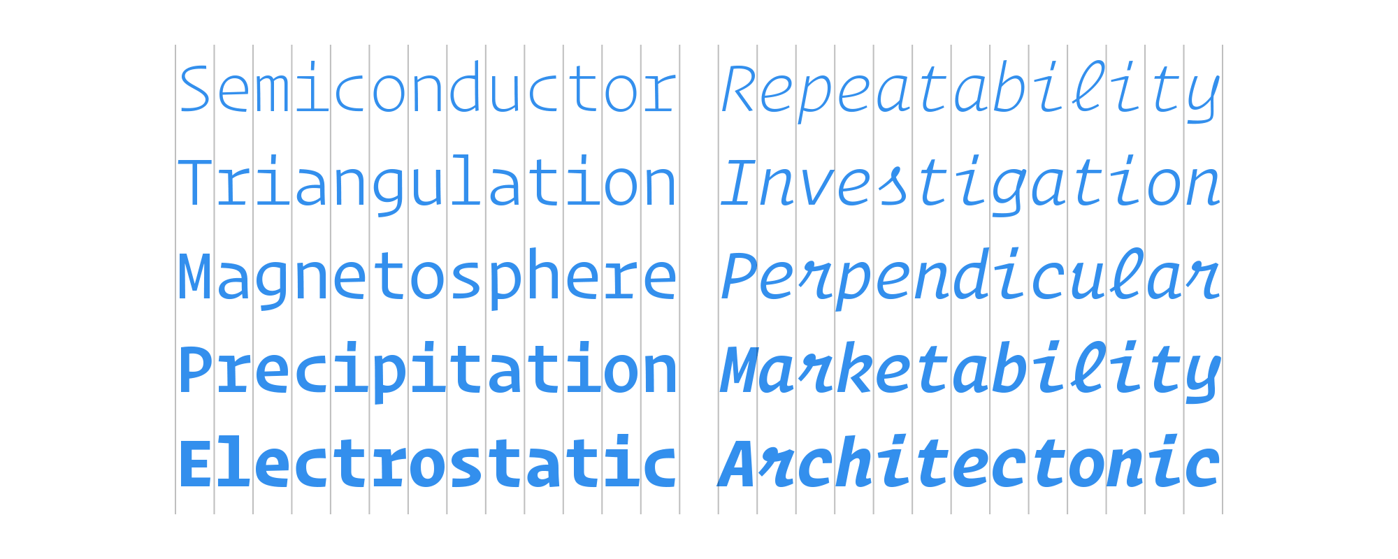
The new SF Camera font is delightful. Literally no one is going to buy an iPhone 11 just to get a slightly more industrial-looking font in the Camera app, but it’s a nice bonus. Update: OK, OK, we all know there’s at least one person who might buy an iPhone 11 just to get the new SF Camera font.

I’m actually disappointed John didn’t go into greater detail on the new SF Camera font — I was secretly hoping it would have a whole section in his review.


The Interrobang — an Attempt to Expand the Typographical Toolkit →

August 6, 2018 · 10:54

Joe Rosenberg, for 99% Invisible:

Aristophanes’ system became the basis for Western punctuation. A partial thought — followed by the shortest pause — was called a comma. A fuller thought was called a kolon. And a complete thought — followed by the longest pause — was called a periodos. These rhetorical units eventually lent their names to the comma, colon and period we know today.

More punctuation followed. Medieval scribes gave us the earliest forms of the exclamation mark. And in the 8th century, Alcuin of York, an English scholar in the court of Charlemagne, quietly introduced a symbol that would evolve into the modern question mark. Ever since, we’ve ended our sentences with one of these three ancient marks, called end marks.

There have, however, been attempts to expand this typographical toolkit, and include other end marks. One such example has made it into dictionaries: the interrobang (‽).

I love these types of stories.


One Space Between Each Sentence, They Said →

May 6, 2018 · 09:58

Avi Selk, writing for The Washington Post:

Ob viously, thereneed to be standards. Unless    you’re doing avant – garde po e try, or    something , you  can’tjustspacew ords ho w e v   e    r   y      o        u            want.     That would be insanity. Or at least,

obnoxious.

Enter three psychology researchers from Skidmore College, who decided it’s time for modern science to sort this out once and for all.

I’m still not convinced, especially since the test was conducted using a fixed-width font. The article is perfect though — go read it, spacing and all. It also has the perfect correction:

Note: An earlier version of this story published incorrectly because, seriously, putting two spaces in the headline broke the web code.

via @ania13


No More DISQUS Comments (And Typography Changes)

August 20, 2017 · 13:20

DISQUS have informed me that they will be introducing ads to their commenting system on my site in the following week or so, hence I have chosen to remove their service from Infinite Diaries. They do offer an ad-free experience, but I would have to pay for their pro tier, which makes no sense whatsoever in this case.

In the meantime, I have also modified the typography used on Infinite Diaries, settling on Lato and Noto Serif.

Update

You can additionally login via WordPress, Twitter, and Facebook to leave a comment.

Update 2

I turned Noto Serif off. It didn’t fit.


Back to Using the System Font Stack in CSS

June 5, 2017 · 10:20

After looking at a variety of options from Google Fonts — Open Sans, Source Sans Pro, and a few others — I decided to go back to the system font stack for a number of reasons. Performance is definitely my main metric, but the lack of interesting options on Google Fonts is another. I could use TypeKit or Cloud.typography, but Adobe decided not to include the former in their Creative Cloud Photography Plan and the latter is just too much for my needs (in terms of price too).

font-family: -apple-system, BlinkMacSystemFont, "Segoe UI", Roboto, Oxygen, Ubuntu, Cantarell, "Fira Sans", "Droid Sans", "Helvetica Neue", sans-serif;

I believe I’m targeting every relevant platform. As far as I know, these are the current popular system font stacks in use:

WordPress:
font-family: -apple-system, BlinkMacSystemFont, "Segoe UI", Roboto, Oxygen-Sans, Ubuntu, Cantarell, "Helvetica Neue", sans-serif;

Medium:
font-family: -apple-system, BlinkMacSystemFont, "Segoe UI", Roboto, Oxygen, Ubuntu, Cantarell, "Open Sans", "Helvetica Neue", sans-serif;

Ghost:
font-family: -apple-system, BlinkMacSystemFont, "Segoe UI", Roboto, Oxygen, Ubuntu, Cantarell, "Fira Sans", "Droid Sans", "Helvetica Neue", sans-serif;

Github:
font-family: -apple-system, BlinkMacSystemFont, "Segoe UI", Roboto, Helvetica, Arial, sans-serif, "Apple Color Emoji", /* Emojis*/ "Segoe UI Emoji", /* Emojis*/ "Segoe UI Symbol"; /* Emojis*/

I went with Ghost. Let me know if you find any bugs or anything else out of the ordinary.


Variable Fonts, a New Kind of Font for Flexible Design →

September 19, 2016 · 09:47

Tim Brown:

Just minutes ago, at the ATypI conference in Warsaw, the world was introduced to a new kind of font: a variable font. Jointly developed by Apple, Google, Microsoft, and Adobe, a variable font is, as John Hudson put it, “a single font file that behaves like multiple fonts”. Imagine a single font file gaining an infinite flexibility of weight, width, and other attributes without also gaining file size — and imagine what this means for design.

This will be awesome!


Operator Mono from Hoefler & Co. →

February 9, 2016 · 22:43

John Gruber:

I heard that Hoefler & Co. were working on a monospace typeface a few months ago, and the result is everything I expected: distinctive, attractive, and practical. The script face for the italics is a little wild, but why not go a little wild on the italics in a monospace typeface?

I have a few fonts which are on my favourites list. Operator Mono just pushed one of them off of it.


Kit Hinrichs’s Typography Calendar →

December 17, 2015 · 09:50

Terri Stone:

There are no illustrations or photos in the calendar, named 365. Type plays the starring role, with each month showcasing a different face. Numbered days of the month dominate the page, but look in the upper left-hand corner of the page and you’ll see a small block of text that quietly delivers information about the typeface, its designer, and contemporary technological influences.


Surfin’ Safari Details How to Use Apple’s San Francisco Font in CSS →

November 16, 2015 · 14:30

Myles Maxfield:

Web content is sometimes designed to fit in with the overall aesthetic of the underlying platform which it is being rendered on. One of the ways to achieve this is by using the platform’s system font, which is possible on iOS and OS X by using the “-apple-system” CSS value for the “font-family” CSS property. On iOS 9 and OS X 10.11, doing this allows you to use Apple’s new system font, San Francisco. Using “-apple-system” also correctly interacts with the font-weight CSS property to choose the correct font on Apple’s latest operating systems.

Tempted to try it on here…