John Gruber:
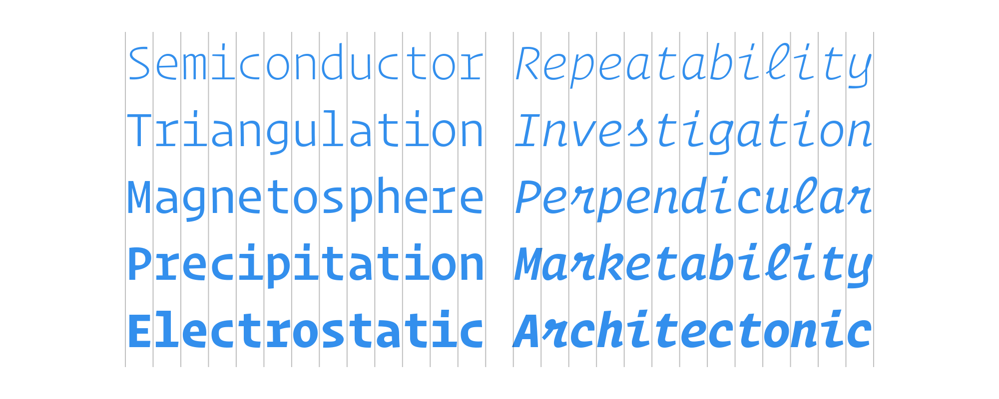
I heard that Hoefler & Co. were working on a monospace typeface a few months ago, and the result is everything I expected: distinctive, attractive, and practical. The script face for the italics is a little wild, but why not go a little wild on the italics in a monospace typeface?
I have a few fonts which are on my favourites list. Operator Mono just pushed one of them off of it.


Chcesz zwrócić mi na coś uwagę lub skomentować? Zapraszam na @morid1n.