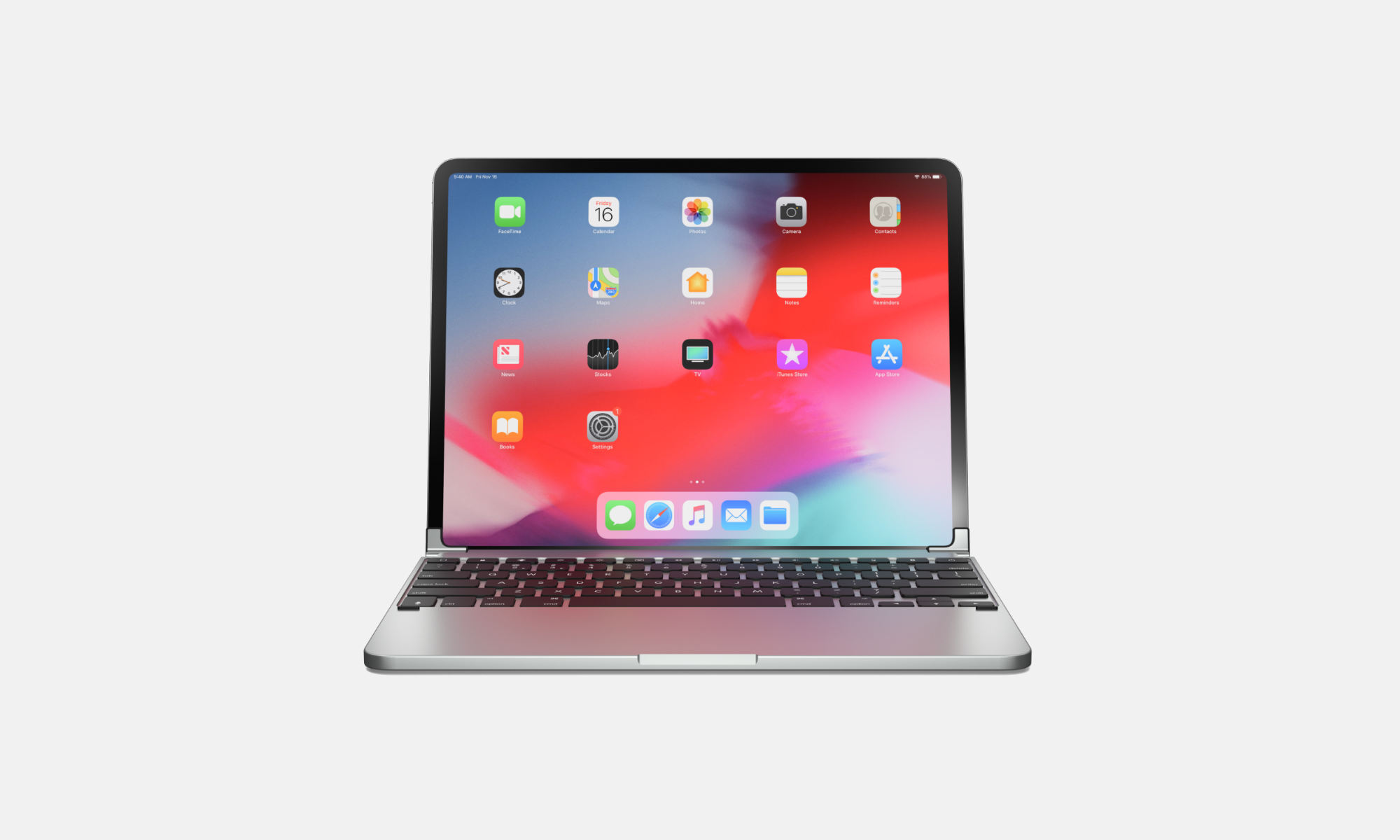
Why I’m Returning the iPad Pro Magic Keyboard

April 23, 2020 · 21:44

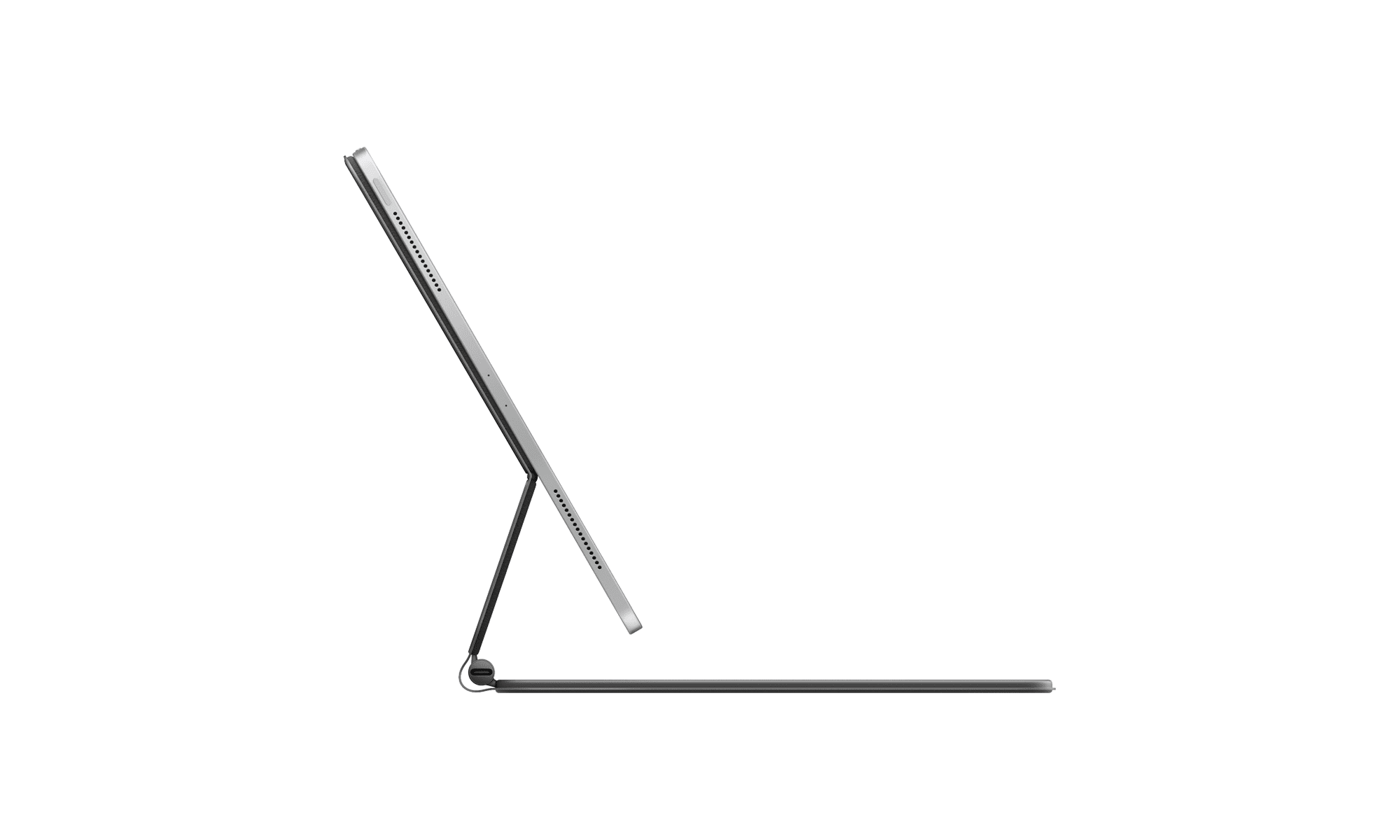
First of all, as you may have noticed, I love me a good keyboard. Despite the Magic Keyboard not being mechanical and having an excellent trackpad, it’s simply too expensive. It costs 330 EUR or so over here (around 360 USD), which I can’t realistically accept, especially since I have a MacBook Pro right next to me. I can always use it instead, when I do need to write something longer.

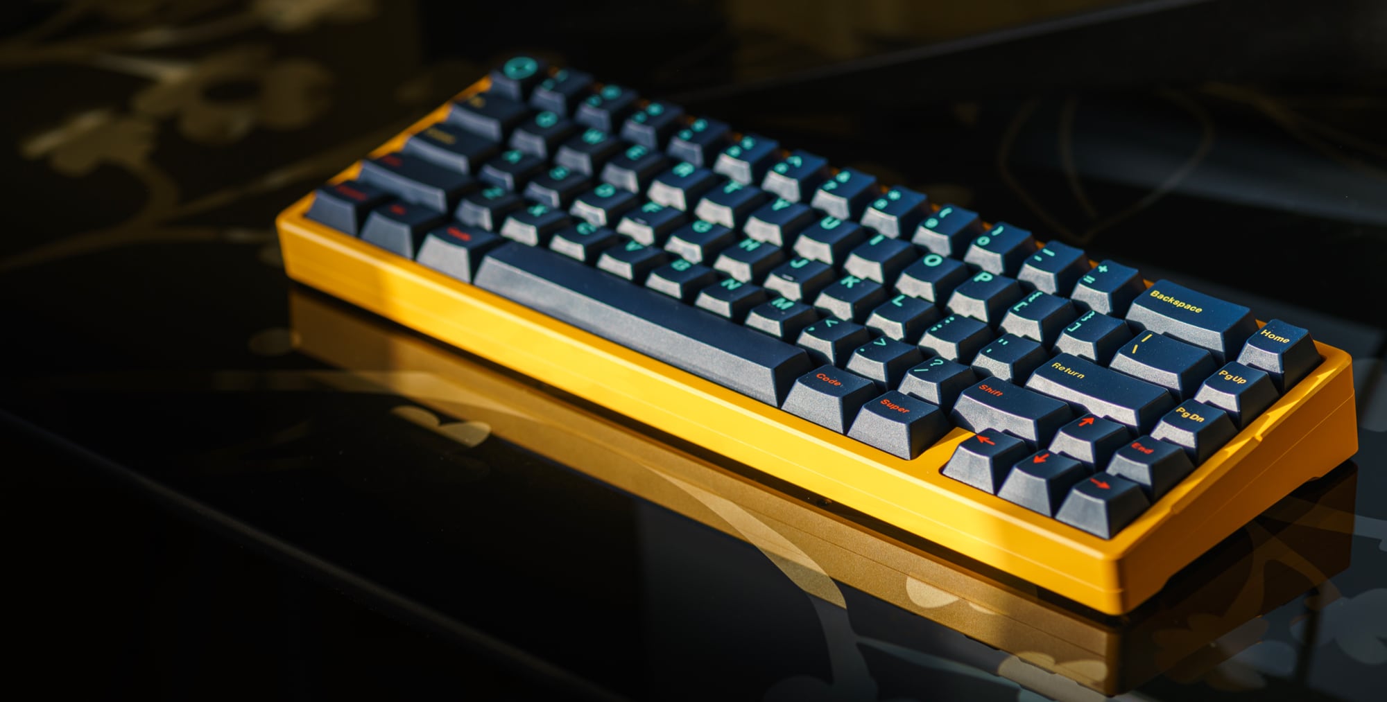
Sorry Apple, you have made a truly excellent product, but it’s just simply not worth the money that you’re asking for it. And I’m a guy that loves (mechanical) keyboards, your trackpads, iPads and Macs. Oh well, back to my beloved Think6.5° in e-yellow…


Is Apple’s iPad Pro Magic Keyboard Worth 299 USD?

April 22, 2020 · 13:17

No. It’s an amazing piece of hardware and I have been using it for two days now, but there’s nothing in its design that justifies it being so expensive. This is a product that should cost 199 USD at most, for the 12,9” model at that. There are comparable products for competing computers out there that cost even less (129 or 159 USD for Microsoft’s Type Cover; the kickstand is built into the Surface itself).

What’s worse, looking at Apple’s past practices, is that I don’t see the current Magic Keyboard being compatible with the next iPad Pro. It was shocking to see that it supports the 2018 iPad Pro, but if I were a betting man, I’d say that the next generation iPad, whether is comes in late 2020 or in 2021, will not support this accessory. If that indeed happens, it would make the current price point to be even more absurd.

Please stop milking your customers Apple. You’re better than that.


A Week of Podcasting With Only an iPad Pro →

February 20, 2019 · 09:59

Jason Snell, on Six Colours:

Last week I took a trip during which I needed to record three podcasts (Liftoff, Download, Six Colors Subscriber Podcast) with guests who would be participating via Skype. I almost took my trusty old MacBook Air with me, but I decided to see if I could figure out a way to replicate the bulk of my home recording setup without requiring a Mac.

While I can do a lot on an iPad, I am still constantly amazed how many hoops people are willing to jump through to do something, which wouldn’t be an issue on MacOS (or Linux/Windows for that matter). I’m at a point where I can’t be bothered anymore (if I don’t already have a workflow set up for a particular problem).


New iPad Mini 5 Will Look Like Old iPad Mini 4 →

February 12, 2019 · 09:04

Benjamin Mayo, for 9to5Mac:

The iPad mini 5 is not going to be the most exciting of updates according to recent reports. Macotakara says informed accessory manufacturers indicate the new iPad mini will look almost identical to the iPad mini 4 design.

A low-cost iPad mini could potentially become a hit for people who need something more portable than a 9.7-inch iPad, but what I really want to see is a small iPad Pro in the new design. That could get me to justify using two iPads Pro — a small one for travel, and a 13-inch model for the home.


Vortex Race 3 — A Mechanical Keyboard for My iPad Pro

January 28, 2019 · 10:13

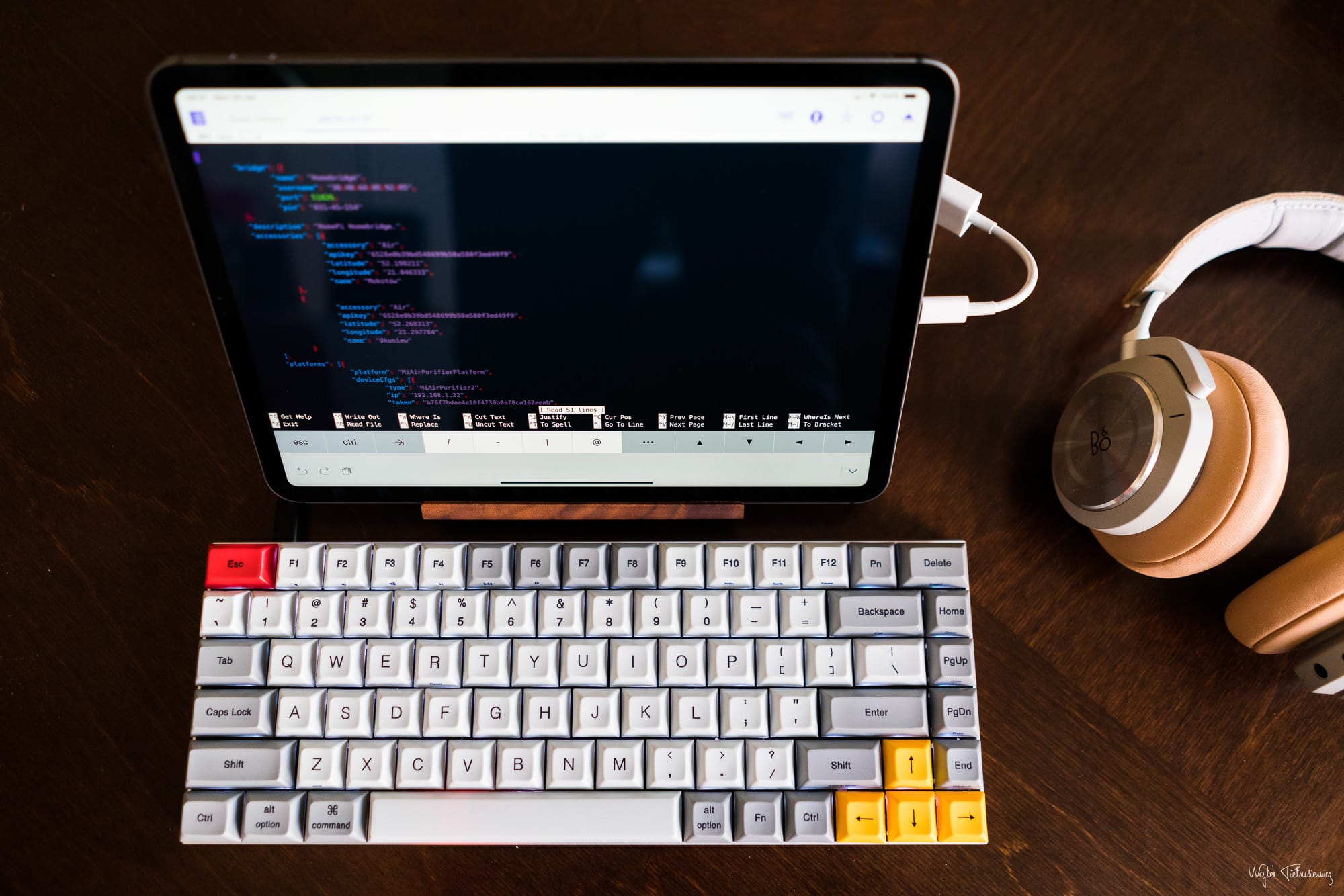
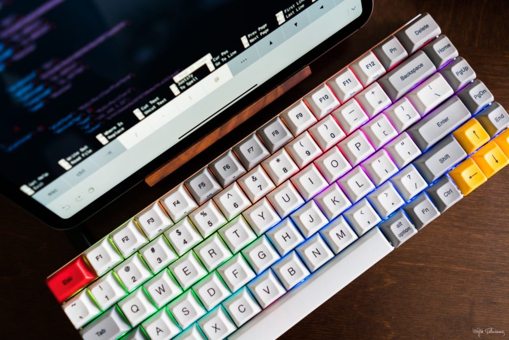
My Vortex Race 3 arrived while we were away on our vacation, so naturally I spent most of last night playing around with it, instead of sleeping like any sane person would. I’ve already preprogrammed the first layer and it seems to suit my needs perfectly, connected to both the iPad and Mac.

I’m very excited to go back to a mechanical keyboard, especially since I’m frustrated with the one in my MacBook Pro.

Rainbow backlight turned on only for the purpose of taking the photo — I don’t actually use it.


TJ Luoma’s Review of the Luna Display →

January 2, 2019 · 09:30

TJ Luoma, on Rhymes with Diploma:

Using the Luna Display with my 12.9″ iPad Pro feels almost as if I am using macOS as a native iOS app. The speed and responsiveness are great, and it’s straightforward to use. However, there are some important caveats, especially if you are using a smaller iPad or if you are not using the iPad as a second display for your Mac.

I’m sorely tempted to get one of these, even though I don’t really know what I’d use it for.


Hands on With the Brydge 12.9 Pro Keyboard →

December 29, 2018 · 10:38

Jason Snell, on Six Colours:

iPads with new shapes usually require new accessories. While I’ve been writing on my new iPad Pro with Apple’s Smart Keyboard Folio, I’ve been anxiously awaiting the release of a new version of my go-to travel keyboard for iPad, from Brydge. It’s a Bluetooth keyboard that’s designed like the bottom half of a laptop, with a couple of clips into which you slide the iPad Pro.

While the new $170 Brydge 12.9 Pro keyboard isn’t yet shipping, the company sent me a prototype to use for a week. It’s going to be hard to send it back and wait for the final version to ship in early spring. It’s the same great laptop-style experience, in a new smaller design that’s shaped like the new iPad Pro itself.

I only wish either iOS or Brydge offered a way to remap keys. Otherwise, while larger than the Smart Keyboard Folio from Apple, this seems like a much better product and something Apple should have made. Though looking at their current pricing policies, I’m glad they didn’t, because it would probably cost $399.


’The iPad and iOS Nowhere Near As Far Along As the Mac Was a Generation Ago’ →

November 20, 2018 · 08:35

John Gruber, on Daring Fireball:

But, I will object to one thing: the iPad feels like a young platform, yes, but it’s not young. It’s over 8 years old. Steve Jobs was still around to introduce it. When the Mac was 8 years old in 1992, System 7 had been launched and it was a very advanced platform, suitable for work of any kind. The new iPad Pro hardware might be the best consumer computer hardware ever made — the only rivals are the iPhone XS and XR. But software-wise, the iPad platform is nowhere near as far along after 8 years as the Mac was a generation ago. The iPhone is. But the iPad is not, and I don’t see how anyone can deny that.

Apple slowed down evolving iPadOS features in the beginning and then tried to speed them up as the hardware started to get better at a rapid pace, but the software team just can’t keep up. It’s still missing utterly basic functionality and I’m really hoping iOS 13 is a big one for the iPad. June is so far away though…


I ❤️ iPad

November 17, 2018 · 11:38

I’ve always really enjoyed using the iPad as a secondary device but the new iPads Pro take things to a whole new level.

I just can’t get enough of that gorgeous new screen.


Fedrico Viticci’s First 48 Hours With the New 12.9-inch iPad Pro →

November 13, 2018 · 07:05

Federico Viticci, on MacStories:

In practice, I find the iPad Pro’s new design appealing for a couple of reasons. Visually, it’s striking. Whether I’m holding the iPad Pro and using the multitouch keyboard or typing at a desk with the Smart Keyboard Folio, all I can see is a screen that elegantly reaches the corners of its enclosure and embraces them. It’s beautiful, and a testament to Apple’s terrific work on Liquid Retina displays. Again, compared to older iPads it instantly feels like the future, available today. The new iPad Pro elicits the same feeling of last year’s switch from the iPhone 7 to the iPhone X, albeit at a much bigger scale.

Like the iPhone 4 (Retina) and later the iPhone X (“all-screen”) were the two major stepping-stones to the future, the 2018 iPad Pros’ design make it feel like a completely new visual experience — a first since the original iPad from 2010. Realistically, nothing much has changed, but it feels like we have the future in our hands.

From an ergonomic standpoint, I also believe the new design makes it easier to hold the 12.9″ iPad Pro in both landscape and portrait; particularly for portrait orientation, I find typing with my thumbs on the software keyboard sort of possible again, whereas the old design with the thicker bezels on each side often resulted in giving up thumb-typing on the large iPad after a few minutes.

Federico states that thumb-typing is “sort of possible”, which makes me glad I went for the 11-inch model. I probably wouldn’t have thumb-typed this post on its larger brother, either going for an external keyboard or my MacBook Pro instead.


Should Apple Make a 15-inch iPad Pro →

November 12, 2018 · 10:02

Chance Miller, on 9to5Mac:

With the recent push towards smaller bezels, some are calling for Apple to make an even bigger iPad Pro. While the largest iPad currently sold by Apple is 12.9-inches, some iPad fans say Apple could push that to around 15-inches.

For instance, a couple of weeks back, developer Steven Troughton-Smithshowed off how iOS would need little work to be capable of running on a 14.9-inch iPad Pro. Safari, for example, could show two side-by-side tabs, as well as a third app with a 14.9-inch display.

I had the opportunity to use a 15-inch Surface Book 2 for a few weeks and I found myself using the screen detached quite a lot. Sure, it’s unwieldy at that size, but when I sat down in a comfy chair, I used it in portrait, resting the bottom on my lap. At 15 inches, it was a huge reading slab, perfect for browsing my RSS feeds or the web, for example. The funny thing is that the 12.9-inch iPad is actually worse in this scenario — it’s too small to use rested in my lap and too heavy to use one-handed.


Will Hains And Marco Arment on the Wobbly Smart Keyboard Folio →

November 11, 2018 · 09:35

Will Hains, on his blog:

I heard my friend Casey describe a car he was reviewing as “tossable”. I’m pretty sure that’s not a word in any version of the English language, but the meaning is clear.

That word floated up in my mind as I struggled to fold and unfold the 12.9-inch behemoth, to pry it from my office desk, and to get it in and out of my bag. It felt too awkward and unwieldy to quickly whip out while on the train and crunch through a few email replies.

I got very good at handling my old 10.5-inch iPad Pro, even propping up the too-clever-by-half keyboard cover. It was just more… tossable.

I too was extremely tempted to go down the 12.9-inch route at first but then I remembered my experience with the first generation model of this size. I like to use my iPad to read and thumb-type (e.g. when using Twitter) and the on-screen keyboard of the larger model is just not built for this. It should be smaller (or there should be a choice of an alternate keyboard). Weight is another issue — personally I don’t find it comfortable to hold with one hand for extended periods of time. The larger screen and the ability to run two full-sized portrait apps next to each other do not make up for this.

In practice, it means the top edge of the iPad Pro 12.9”, when propped up in its keyboard cover is very high off the desk. It’s harder to reach the top of the screen when there’s no keyboard shortcut to go back a screen, and the left-edge swipe gesture is unavailable. And when I did tap the top of the screen, the whole thing wobbled.

I first read about the wobbly screen in the Smart Keyboard Folio in Will’s post and layer saw that Marco Arment mentioned it in his video review. Do watch the whole thing — it comes at the iPad from a different and interesting perspective.

I don’t believe I saw anyone else mention this in anywhere else and it could be a deal-breaker for some. Personally, I’m not getting Apple’s Smart Keyboard Folio — it’s just too expensive for what it offers.

Having said all that, I just thumb-typed this post on my 11-inch iPad, which I wouldn’t have bothered to do on the 12.9-inch model — I’d have put it off for later, when I had an external keyboard connected.


Apple Walks Ars Through the iPad Pro’s A12X System on a Chip →

November 8, 2018 · 10:07

Samuel Axon:

The iPad Pro outperforms every MacBook Pro we tested except for the most recent, most powerful 15-inch MacBook Pro with an 8th generation Intel Core i9 CPU. Generally, these laptops cost three times as much as the iPad Pro.

“You typically only see this kind of performance in bigger machines—bigger machines with fans,” Shimpi claimed. “You can deliver it in this 5.9 millimeter thin iPad Pro because we’ve built such a good, such a very efficient architecture.”

The hardware is plenty fast. Now we just need software to make real use of all this horsepower.


iPad Pro 10.5-inch vs. 11-inch On-Screen Keyboard

November 6, 2018 · 11:54

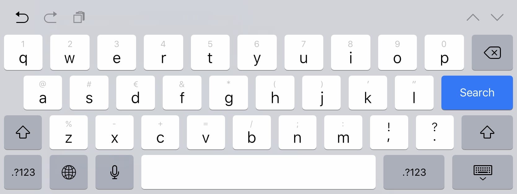
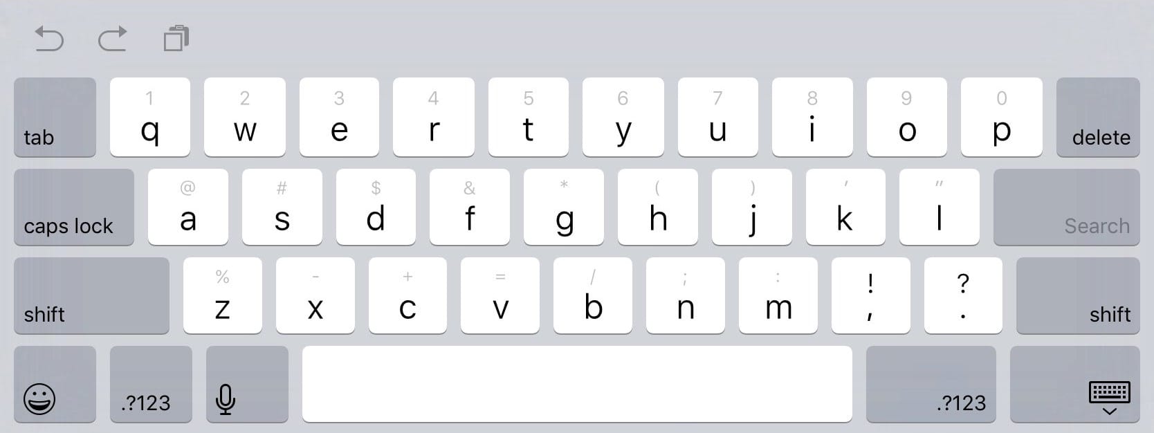
Since the iPad Pro reviews have started to trickle out yesterday, I was looking for a comparison between the on-screen keyboards. I own a 10.5-inch iPad and will be switching to the 11-inch model tomorrow (hopefully, if there are no delays!), but I couldn’t wait. Luckily Steve Troughton-Smith had the simulator handy and helped me out1.

Above is the 10.5-inch keyboard in portait orientation, while the new 11-inch edition is below. You can click the images to load them full-screen and use the arrow keys (or swipe on them) to navigate between the two.


Make of this what you will but I can’t say that those additional keys are useful for the way I use my iPad. I’ll find out soon enough, but I am curious if it will be more comfortable to thumb-type on than the older one.

  1. Thanks Steve!

Apple iPad Pro Review 2018 — Future of Computing, Not a Laptop Replacement →

November 5, 2018 · 15:43

Nilay Patel, for The Verge:

I use Lightroom CC all the time and I would love to manage and edit all my photos on an iPad Pro, especially since editing with the Apple Pencil is so much fun on this display. But I have no desire to import hundreds of RAW files into my camera roll and iCloud photos account. When I brought this up, Apple very proudly pointed to a new Siri Shortcut from Adobe that imports photos from the camera roll into Lightroom and then automatically deletes them from the camera roll.

I couldn’t test that Lightroom Siri Shortcut, since it’s not yet available. But I can tell you that macro-based hacks around the limitations of an operating system are not usually included in bold visions of the future of computing, and that Siri Shortcut is a pure hack around the limitations Apple has imposed on the iPad Pro.

Oh, but it gets worse. I shoot photos in JPG+RAW, and the iOS PhotoKit API only allows apps to grab one or the other from the camera roll. So I could only import my RAW images into Lightroom, leaving the JPGs behind to clutter up my camera roll and iCloud storage. That’s untenable, so I just gave up and imported everything directly into Lightroom using my Mac, because my Mac doesn’t insist on abstracting the filesystem away into nonsense.

This is my single biggest gripe with Apple and Adobe — they still haven’t figured out how to make this as simple as on a Mac (or Windows machine, for that matter). This basically makes it impossible for me to use an iPad for processing my RAW files. I’m still hoping both companies get their act together, but after 8 years, I’m closer to just accepting this won’t happen.

Apple seems to want it both ways with the iPad Pro: it loves to tout the iPad’s laptop-dwarfing sales figures and industry-leading performance, but when pushed on the iPad’s limitations, the company insists that the iPad is still an ongoing attempt to build the future of computing, not a laptop replacement.

But after eight years, this double-sided argument is no longer tenable. Unlike virtually every other computer, the iPad is a product of Apple’s singular vision: the company designs the display, the processor, the operating system, and the limits of the applications and accessories that plug into it. And after all this time, it’s clear that whatever roadblocks and frustrations exist in using the iPad Pro are there because Apple wants them there. There just aren’t that many excuses left.

I still love the iPad but it’s far from being a laptop replacement for so many people. Apple did finally cave and introduce the Files.app so I’m keeping my fingers crossed for substantial changes in iOS 13, but I’m not holding my breath.


New iPad Pro to Drop Headphone Jack, Move Smart Connector to Bottom to Accommodate Vertical-Only Face ID →

July 30, 2018 · 09:49

Chance Miller, for 9to5Mac:

First off, the report offers additional details on the 2018 iPad Pro dimensions. The 10.5-inch model is said to come in at 247.5mm (H) x 178.7mm (W) x 6mm (T), compared to the current dimensions of 250.6mm x 174.1mm x 6.1 mm.

Meanwhile, the 12.9-inch iPad Pro is said to stack up at 280mm (H) x 215mm (W) x 6.4mm (T), which compares to the current-generation model at 305.7 x 220.6 x 6.9 mm. With these dimensions, it seems that Apple is focused more on reducing the overall footprint of the 12.9-inch model, fitting the same size display into a considerably smaller body.

While a larger screen to body ratio is always good, I hope the new iPads are lighter than the current models. If Microsoft can create an 800 gram Core i7 15” tablet (just the screen part from a Surface Book 2), I hope Apple can lower its 12,9-inch iPad from 692 grams to something more reasonable.

The report goes on to explain that Apple is likely to ditch the headphone jack with this year’s iPad Pro models, a move the company first made with the iPhone 7. While Apple includes a Lightning to 3.5mm headphone adapter to ease the blow for iPhone users, it will not do the same for iPad Pro users, according to today’s report.

I don’t much care for the headphone jack anymore but I am a bit concerned about the new iOS 12 gestures — I’ve come to really like how iOS 11 handles all the swipes — and the fact that the Face ID camera will only work in one orientation. Oh, and about that adapter — Apple used to include many small accessories in their products (cloths for wiping MacBook screens for example), which were a nice touch. I miss those.

What exactly this means is unclear, but the report explains that “the next iPad Pro Smart Keyboard may be changed to vertical position specifications.” This is seemingly implying that the iPad Pro would dock vertically into the Smart Keyboard, but how that would work is vague at the moment.

The iPad really should feature two Smart Connectors, so that it can be used in both portrait and landscape. I vastly prefer typing in portrait mode but prefer landscape for other things.


The New iPad Pro Screen Is Amazing →

June 23, 2017 · 15:32

Gabe Weatherhead:

Most of what I’ve read or heard about the new iPad Pro is close to reality but I think the effect of the new 120 Hz refresh rate of the screen is being over stated. It’s nice but it is not dramatically better. It’s not even that noticeable. Scrolling looks better, but it’s minor. From the early reviews you might expect more but I think there was a lot of pent up excitement for the iPad Pro revision.

I cannot stress how much I don’t agree with this. The new ProMotion screen is jaw-dropping. The smoothness of the animations and scrolling are fantastic, and in a few short minutes, have ruined my iPhone’s screen. If you use an iPad a lot and can afford to get one, do so.


Quick Thoughts on WWDC 2017

June 13, 2017 · 21:44

I haven’t had enough time to think about all the WWDC 2017 announcements yet — there were so many — so I’ll most likely voice my thoughts and perhaps even come to some conclusions on a future podcast episode, but in the meantime, I wanted to share some of my thoughts and worries.

Continue reading →


Federico Viticci on the 10.5″ iPad Pro →

June 12, 2017 · 13:30

Federico on MacStories:

I’m not even a week into my tests with the 10.5” iPad Pro, and I think scrolling on my first-gen 12.9” iPad Pro looks choppy now. I’d be surprised if 120Hz displays with ProMotion don’t expand to the iPhone later this year and other Apple computers in the future. The combination of hardware and software really is that good.

At first I just wanted the 12.9″ UI in a 10.5″ form-factor, at 326 ppi. We didn’t get that. I am however extremely curious about ProMotion — I spend 4-6 hours a day on my iPad, scrolling a lot, and this could change everything.

I was curious to see if the larger screen could make the 10.5” iPad Pro a viable alternative to multitasking on the 12.9” model, but, as I imagined, working with Split View on this iPad is the same as the 9.7” version, showing enlarged iPhone interfaces instead of two full-size iPad apps at once. If you were expecting the same Split View experience from the 12.9” iPad Pro, the 10.5” doesn’t allow it.

I admit that I had hoped for the same experience as on my 12.9″ iPad but I think I’ll be able to accept the trade-off.

Unfortunately, Federico does not directly compare the 10.5″ Smart Keyboard with the 12.9″ model, but you can find a comparison to the 9.7″ version in his review.


“Full Size” Keyboard on 10.5″ iPad Pro →

June 12, 2017 · 13:19

Dieter Bohn:

I was all set to complain that increasing the size from 9.7 to 10.5 was not a big enough jump to justify requiring people to buy new keyboards and accessories. Then I started typing on the on-screen keyboard and on the new hardware Smart Keyboard. Even though I’m dubious about Apple’s claim that the software keyboard is “full size,” I find the slight size increase makes touch typing much easier. It’s still a little cramped, but it’s much easier to bounce between this and a real keyboard now.

I currently switch between a Magic Keyboard, a MacBook Pro (late 2016), and the 12.9″ iPad Pro’s Smart Keyboard. I don’t have any major issues doing so. The curious thing is that since getting the MacBook Pro, I now find the Magic Keyboard’s key travel to be too long — I actually prefer the shorter throw now.

I have the new 10.5″ iPad Pro on order — it will replace my 12.9″ — but I’m still hesitating about getting the Smart Keyboard for it. I just don’t like cramped ones…


March 19, 2017 · 13:40

Just got back from our vacation, and as I sat down, I realised that I didn’t have to use my iPhone. iPad! Missed you so much!


iPad Pro 10.5″ Reported to Have 2224×1668 Resolution Screen →

February 27, 2017 · 22:25

Mike Wehner, writing for BGR:

Apple’s long-rumored 10.5-inch iPad Pro is expected to fill in the gap between Apple’s 9.7- and 12.9-inch top-of-the-line tablets, but until now the mythical slate’s display have been a subject of debate. Now, thanks to Rhoda Alexander, IHS Markit’s Director of Tablets and PCs, we might have an answer. Speaking with Forbes, Alexander claims that the new tablet with have a resolution of 2,224-by-1,668, which will allow the 10.5-inch Pro to maintain the exact same PPI ratio as the two existing iPad Pro models.

At that claimed resolution, the new tablet’s pixel density comes in at 264 pixels-per-inch. That matches the 9.7-inch iPad Pro (2,048-by-1,536) and the 12.9-inch version (2,732-by-2,048) in terms of sharpness. That makes a lot of sense for a tablet that is aimed at creative types, and will essentially remove one technical factor from the decision process of anyone shopping Apple’s tablet lineup.

While this theoretically makes sense, I do not believe this will be the case. Adding a 2224×1668 px screen would force developers to adopt yet another resolution, bringing the total up to three (the others are 2048×1536 and 2732×2048). This would complicate many things unnecessarily, including the keyboard, new UI layouts, etc.

I already made this case last year, doing the maths behind the 10.5″ screen. Adopting the 2732×2048 resolution from the iPad Pro 12.9″ makes much more sense. First of all, no major changes to the UI, keyboard, and software would be needed — everything would look exactly like on the 12.9″ model, but smaller. That new 10.5″ screen would have 326 ppi, which is on par with the iPad mini and iPhone 7. Secondly, Apple would retain just two resolutions in the iPad line-up (not counting the non-Retina 1024×768 of course).

This is the simpler and more logical solution, especially since so many people appreciate the additional space and more advanced layout of the 12.9″ UI, including space for two portraits apps side by side, the full keyboard, and more.


The Case for the 10.5-inch iPad Pro →

January 18, 2017 · 12:21

Jason Snell:

Dan Provost of Studio Neat wrote an interesting post last week about reports that Apple is planning on releasing a new 10.5-inch iPad Pro alongside the 12.9- and 9.7-inch versions.

The idea seems kind of far-fetched at first. Provost himself cites John Gruber’s statement that it doesn’t make any sense, but after reading Provost’s post, Gruber said that “the math works out”. And I have to admit, the more I think about it, the more appealing this possible product sounds to me.

I did the math 5 months ago, after Ming-Chi Kuo’s first rumour about the new iPad:

If you take the resolution of the 12.9″ iPad Pro of 2732 x 2048 px (it also has 264 PPI) and shrink it down to 10.5″, you get approximately 326 PPI. This could mean that the 10.5″ iPad Pro would get the slightly larger UI of the biggest iPad in the lineup, together with the better virtual keyboard and more room for two apps side by side.

I have not changed by mind — I love the amount of information that fits on the iPad Pros 12.9″ screen, but I would love to have it in a smaller form factor. My only worry is the Smart Keyboard — I use it because of its full-sized keys. Back to Jason:

A slightly wider iPad Pro would give Apple and third-party keyboard makers a little more room with which to work. Yes, the 12.9-inch model is 65 millimeters wider than the smaller iPad, but a look at the respective Smart Keyboards suggests that the 12.9-inch Smart Keyboard has width to spare. There’s at least 30 millimeters total of wasted space on the sides of the larger Smart Keyboard. Squash a few of the modifier keys at the edges, as on the smaller model, and an iPad that’s only slightly larger would probably allow for a keyboard with full-sized keys.

I really hope Jason is right about this and this is the path that Apple chooses — typing on the 9.7″ Smart Keyboard is a pain for me.

I also wonder if this might be an opportunity for Apple to release its own keyboard cover based on the new butterfly keyswitches it’s using on the MacBook and MacBook Pro, rather than leaving traditional keyboards to the third-party market.

I’ve grown to really like both the Smart Keyboard and the new butterfly mechanisms on my late 2016 MacBook Pro and Magic Keyboard. A marriage of the two would be a very interesting concept. It should also be more than possible — Microsoft’s Surface Pro 4 keyboard is very good.

But I’ll give back a little bit of physical size if it also can bring support for full-sized external keyboards to the party.

Me too!


Apple Is Working on iPad Upgrades and Refreshed Mac Lineup →

August 30, 2016 · 08:34

Mark Gurman:

Apple Inc. is developing new features for the iPad to cater to professional users, along with new Mac laptops and desktops, according to people familiar with the matter.

Upcoming software upgrades for the iPad include wider operating-system support for Apple’s stylus accessory, while hardware performance improvements are also in development, according to the people. The refreshed Mac hardware line includes new versions of the iMac desktop, MacBook Air laptop, and a 5K standalone monitor in collaboration with LG Electronics Inc., in addition to a thinner MacBook Pro laptop.

The one thing that surprised me is that mention of a new MacBook Air. I thought they were basically dead, especially now that there’s a MacBook in the lineup, with a much better screen.


Todd Was Wrong About the iPad Pro →

August 22, 2016 · 22:23

Todd Haselton:

I’m quick to criticize new products, our readers know that all too well, but I was wrong about the iPad Pro.

Respect.

I personally know a few people who totally trashed the iPad until the day they spent some time with it and got it. They then went and got one for themselves.