Dr. Drang:
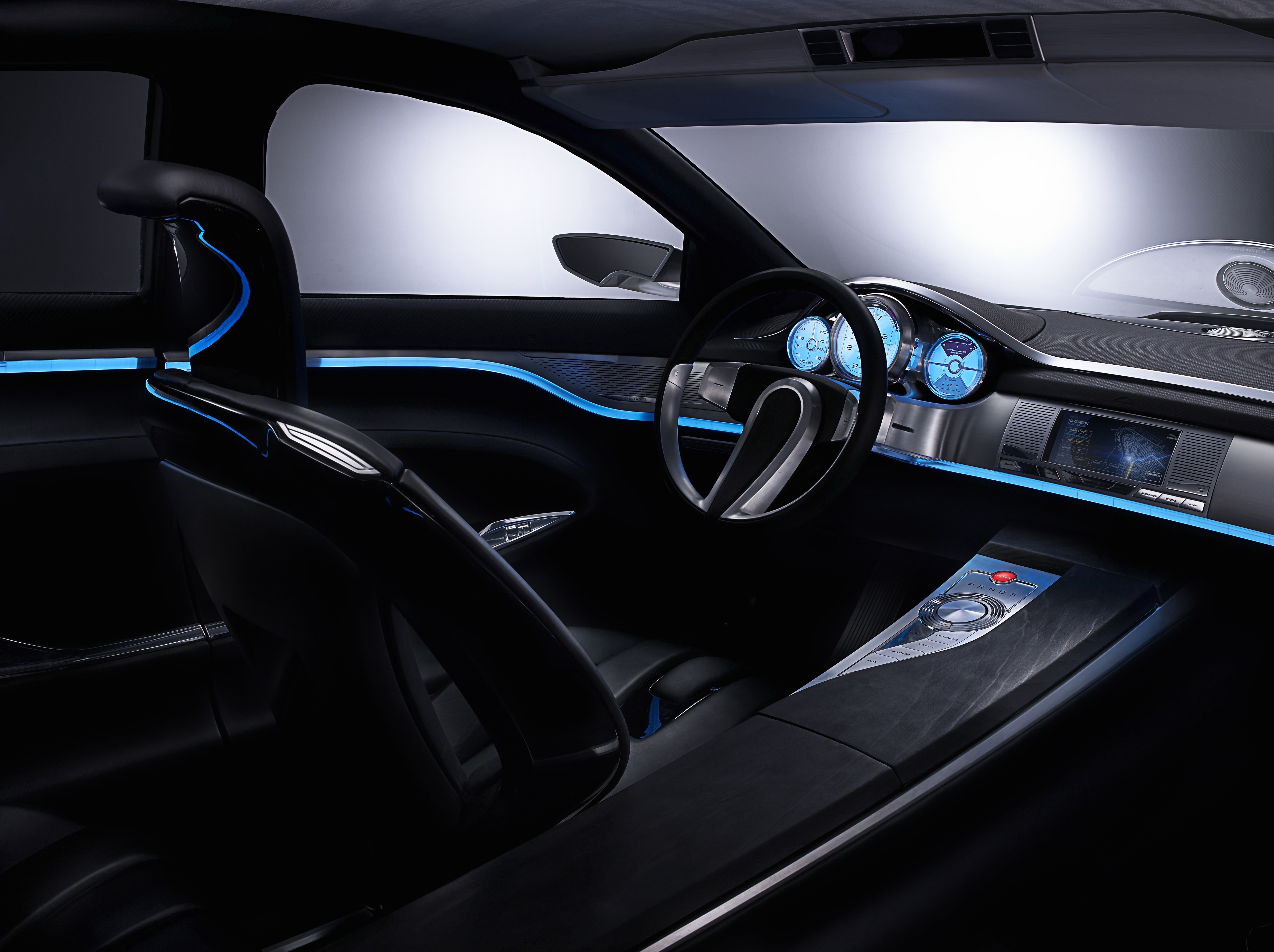
It’s common for Apple users to say they wish Apple could take over their car’s user interface because the auto manufacturers do such a bad job of it. This is typically a comment on the electronic user interface, as many cars now have a little computer screen in the center of the dashboard with poorly laid out buttons and displays. I agree and take it further: I wish Apple (or anyone who thinks carefully about design for use) would have a go at the physical controls, too.
User interfaces in cars used to be all buttons and have recently been upgraded with screens and even touch screens. Tesla has gone a step further than anyone else. The problem with touchscreens is that they do not provide physical feedback nor can they be operated without looking at the screen. This is both good and bad and unfortunately the bad can cause you to die in a fiery crash. I still recall Auto Motor Und Sports car infotainment driver attention test from a few years back, just when BMW’s iDrive, Mercedes’ COMMAND and Audi’s MMI were becoming popular—drivers unfamiliar with these systems were timed at performing various basic tasks while driving. The data was compared against an old Mercedes 190 which had a button-only interface. The results were staggering–the new systems required over two minutes of attention for tasks that took a few seconds in the old Merc.
Perhaps voice is the future, but it will need to get better quickly. Neither Siri nor Google Now is even close.
Dr. Drang also mentions his windshield wiper stalk:
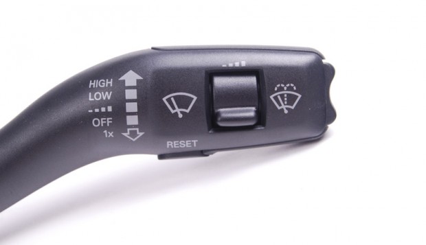
My pet peeve on my Toyota Camry is its windshield wiper stalk. It grows out of the right side of the steering column and has a variety of controls. The stalk as a whole can move up and down into one of five positions shown in the little graphic near the left side of the photos below. From the off position, you can move it down into the intermittent position, the low speed position, and the high speed position—the heavier the rain, the further down you move the stalk.

VW, BMW and Audi have done this the other way around. One swipe down (stalk returns to OFF position) just wipes the windshield. One position up from OFF is intermittent mode, then low speed and high speed. The interval control in the middle of the stalk controls and length of the pauses between wipes—down is long and going up decreases their length. I’ve had this system in all the german cars that I’ve driven in (perhaps apart from Mercedes and Opel, they might have a different system if I recall correctly) and it’s always been intuitive. Intermittent mode is also aided by the rain sensor if the car has one and this works perfectly on my Audi at least (and a 2000 BMW 3-series too).


