ClassicKit for iOS →
Blake Tsuzaki on GitHub:
This is a little exploration into applying ’90s-era design & principles into a modern platform with some primitive components. The assets and design metrics were (for the most part) taken from an actual installation of Windows 95. These are pixel-accurate renditions of the original design…
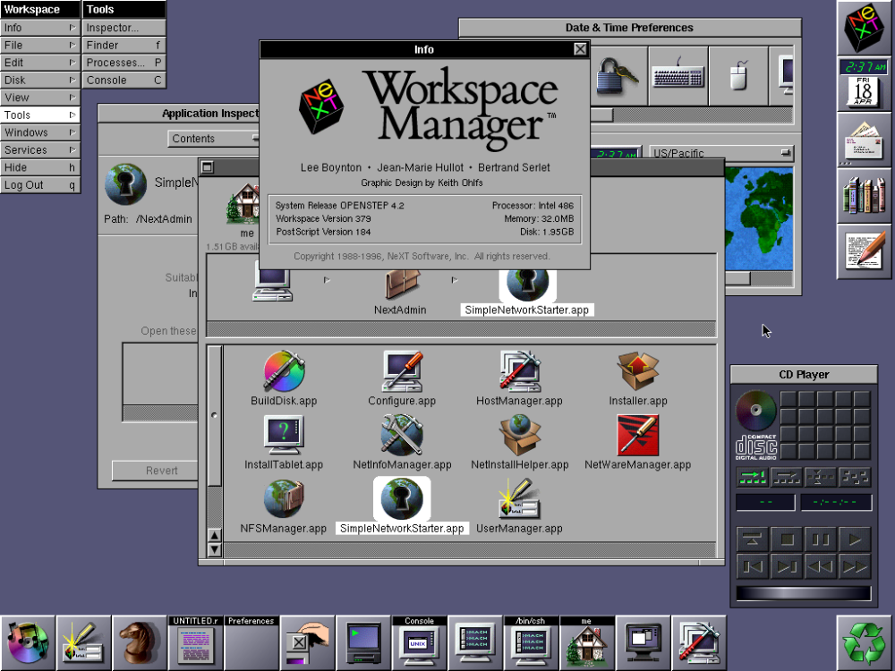
UIs were shockingly ugly back then. I still remember when I first saw a NeXT computer at a trade show in the 1980s, when I was just a few years old — just the resolution of the screen was amazing, but the different look of that OS stunned me and I wanted one badly.

This might not look very special today, but compared to what I was used to, it was simply amazing.

