Paul Thurrott’s piece on the iPhone X caught my eye because of his take on Apple’s design decisions:
Apple’s iPhone X is chock-full of new technologies and features, and it has a modern, elegant design that I feel will stand the test of time. But it is also more expensive than any other mainstream smartphone. And it has a few bad design choices that may limit its appeal.
My own complaints are mainly focused around iOS 11 itself, but I was curious on Paul’s take.
[…] some smartphones even offer more technically impressive designs. Samsung’s flagships offer displays that gracefully curve around the edges of the device, creating a truly bezel-less effect. And few phones stick an ungainly notch into the top of the display, ruining the infinity pool effect.
I spent a month with the S8 and S8+ — they are impressive — but if there was one thing I wish they didn’t have, it’s the curved glass. Terrible, terrible decision.
The notch is a problem. We must discuss the notch.
The notch is the wrong decision, and it’s one that Apple, and iPhone users, will now need to deal with for years. And it is the wrong decision on a number of levels.
From a looks perspective, the notch is an unnecessary, jarring interruption of an otherwise beautiful looking visual design. There is an elegance to the curves of the display and the surrounding frame, which match each other perfectly … except for that notch. It’s an affront. An intrusion. And despite assurances from some others I know who own the iPhone X—opinions differ on this one, apparently—you never really do get used to it. It’s like a mote in your eye, always in the way.
It is an affront, but at the same time, strangely enough, I barely notice it.
Apple should have done what Samsung did with its 2017 flagships, what OnePlus did with the 5T, and what virtually all other smartphone makers will do when they adopt this more design in other devices: Just put a bit of bezel at the top of the device. There is no need to intrude into the display.
I’m sure they considered this, but the iPhone would then look like every other phone on the market. My friend recently held up an LG V30 and even seeing it up close, I had to look for the logo — I thought it was the new Samsung set to ship in January.
But design is about more than just looks. Design also encompasses how a thing works. And notch or not, Apple needed some space at the top of the device to house the optical elements that were required for the iPhone X’s terrible Face ID technology.
Terrible? This will be interesting.
And Face ID is terrible by any meaningful metric. I’ll get into this more in the Security section of this review. But the short version is that this design is an unnecessary compromise and inconvenience. A rear-mounted fingerprint reader would have been hugely preferable. This is the iPhone X’s version of the missing headphone jack: A mistake disguised as courage.
Face ID has thus far, subjectively, surpassed all my expectations, beating Touch ID in every single “metric”. Which are the “meaningful” ones, I wonder?
It’s a shame that it needs to be protected with a case. Which it does, given its slippery and non-durable all-glass design.
Still rocking mine without a case. It’s also notably less slippery than the iPhone 7 and 7 Plus.
To display the App Switcher, you swipe up from the bottom of the screen and hold.
You don’t need to hold. Just arc your gesture and the App Switcher will appear. This was a huge mistake on Apple’s part, when they demoed the iPhone X gestures during the keynote.
To access Control Center, you now swipe down from the top right of the screen. This is, of course, different from all other iOS-based devices, where you swipe up from the bottom of the screen to access this interface. But it’s easily learned.
This is the one gesture which is terrible beyond words.
Since Paul doesn’t mind, we obviously have completely different points of view.
The iPhone X display features HDR capabilities plus Apple’s excellent True Tone technologies, which subtly and dynamically color the display to match the light in your surroundings. This is the best implementation of this kind of thing I’ve ever seen—it debuted on the iPad Pro—and it makes reading, especially, delightful no matter where you are at the time.
Whenever I see a screen without True Tone now, I cringe. It’s that good.
The problem with this approach is that great low-light cameras, like that in the Pixel 2 XL, actually use the darkness to great effect: Instead of lighting up the scene, they let you tap to focus on a lit area and create a much more attractive—and sometimes even surreal—photo in which colors and lights pop in the darkness. With the iPhone X, all you usually get is a scene that is as evenly lit as possible, given the conditions.
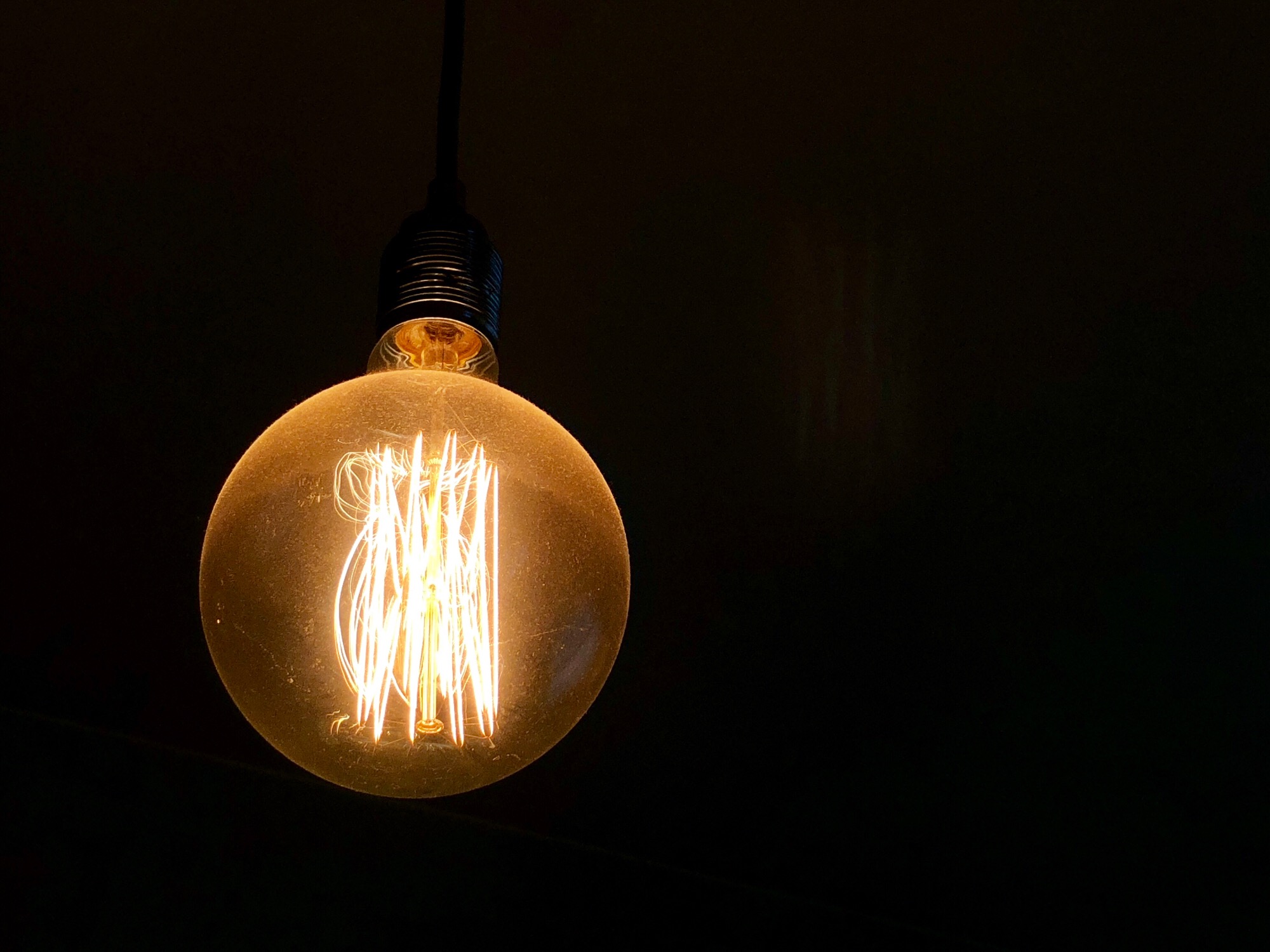
If Paul bothered to tap the screen, focusing on the light bulb in the iPhone shot, he would have gotten the same effect. Proof below.

Portrait Lighting only works with the selfie camera.
Nope. It works with the rear cameras too.
Apple’s use of facial recognition is inarguably the most controversial aspect of the iPhone X. It is also, I think, the iPhone X’s Achilles Heel.
Yes, Face ID works as good, if not better than, any facial recognition system I’ve used. But it’s not particularly fast or convenient when you factor in the time and effort it takes to actually sign-in: You also need to swipe up on the screen in order to actually access the home screen or whatever app you were previously using. It’s tedious.
Effort? What effort? I already have the phone in front of me — the rest is automatic.
I start swiping before the iPhone is in front of my face, in a position where I always hold smartphones. Face ID does the rest in the background. You don’t have to wait for Face ID to unlock before you start swiping.
Worse, it’s time-consuming: Face ID is not nearly as fast as using the Touch ID fingerprint sensor that Apple placed on previous iPhones. And in denying users that option—it could have, and should have, simply put Touch ID on the back of the iPhone X—it has created an all or nothing dilemma for customers. Face ID is easily the worst thing about the iPhone X. Easily.
It’s faster in the 48 days that I’ve used it, even more so when I take into account all the situations when Touch ID fails (multiple times per day). Face ID has failed me twice so far. Not bad. And it’s easily the best new feature of the iPhone X. Easily.
And you will need to use Face ID. To sign-in to your device, over and over again. To use Apple Pay. To approve purchases in the Store. Until of course, you can’t: For reasons I can’t quite explain, I’ve had to type in my Apple ID password—my freaking password, in 2017—more on the iPhone X than I have in years.
Once a Touch ID iPhone was unlocked, the user could get into almost everything, including signing into websites, whose passwords were stored in iCloud Keychain. Not so on the X. Before the iPhone X pastes in your login data, in Safari for example, it verifies that the user is still the owner of the phone. This additional security is priceless.
God, I miss Touch ID.
I don’t. And I can’t wait for Face ID on the iPad and Mac.
Video playback is problematic too, thanks to the notch. You have two choices: You can let the notch intrude into the video, as shown here.
Or you can crop it so that there are black bars on both sides. No, neither is ideal.
This is the result of going to taller that 16:9 screens, which Paul earlier calls “correct”:
Granted, other smartphone makers delivered what is now correctly viewed as the standard for modern flagships—tall, 18:9-ish displays with tiny bezels—well before Apple did with the iPhone X.
Come on Paul, every single taller or wider than 16:9, depending on orientation, screen is going to exhibit this behaviour.
There is no way around this: The iPhone X is expensive. Too expensive, I think.
I completely agree. To some, the price is justifiable, but not to most. I don’t consider the X to be worth the $1430 it costs in Poland. Not even close.
Compared to other flagships smartphones, the iPhone X is crazy-expensive. You can get an excellent Samsung Galaxy S8 or S8+ at a steep discount right now, and these devices feature even more impressive displays than Apple’s offering.
More impressive only considering it’s discounted to half the price of the X. If we remove the pricing factor, it is not superior.
I understand that these are Paul’s subjective views on the X, but I just cannot comprehend how he sees Face ID as the Xs biggest weakness.

